Overview
Whitespace is not wasted space, it is an active design tool. It helps users scan content, understand relationships between elements, and focus on what matters.
For people with low vision or cognitive impairments, crowded layouts increase confusion and errors. At the same time, excessive spacing can break connections between related items. Striking the right balance is key.
Best practices
Guidelines for using whitespace and spacing effectively.
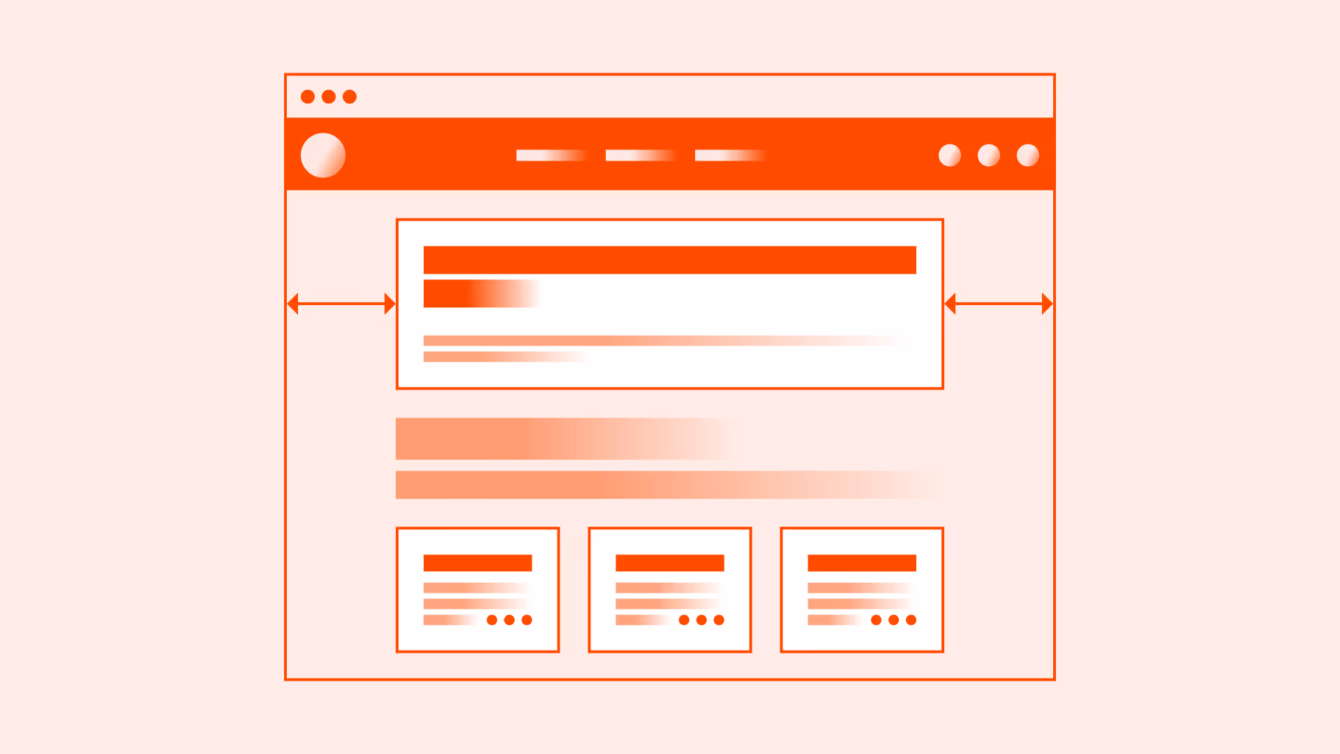
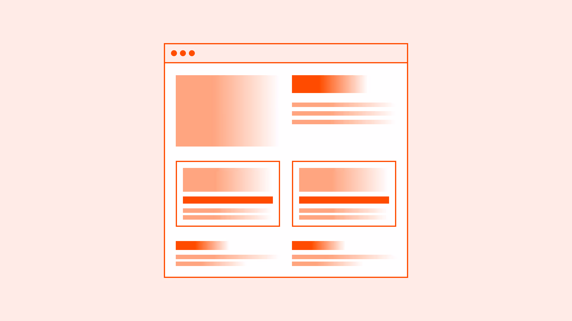
Use whitespace to group related elements
Spacing indicates relationships, such as between a label and its input field. It guides users through structure.
References:
- Gestalt principles – Interaction Design Foundation
- Proximity principle in visual design – Nielsen Norman Group
Maintain a consistent spacing scale
Define a spacing system (for example: multiples of 4px/8px/16px) and use it consistently. This improves predictability and cohesion.
References:
Increase line height for readability
Text should have sufficient line height (typically 1.4–1.6 for body copy). This reduces eye strain and improves readability.
References:
Balance whitespace with density
Too little spacing overwhelms users, too much makes connections unclear. Test with real users to find the right balance.
Common mistakes
Frequent mistakes with whitespace and spacing.
Overcrowding elements with little or no spacing
Increases errors and frustration for users.
Excessive whitespace
Disconnects related elements and forces extra scrolling.
Inconsistent spacing system
Creates a messy, unprofessional feel.
Ignoring mobile contexts
Spacing that works on desktop may be unusable on small screens.
Summary
Key takeaways for whitespace and spacing.
- Use whitespace deliberately to group and structure content.
- Maintain a consistent spacing scale across the system.
- Ensure text readability with proper line height.
- Provide comfortable spacing for touch interactions.
- Balance whitespace and density for clarity and usability.
Effective whitespace is not about “empty space”, it is about giving content room to breathe, improving clarity, and making interfaces more inclusive.
AI prompts
Ready-to-use AI prompts for design agents. Each scenario is pre-loaded with the UX rules from this guide. Copy, adapt to your context, and generate consistent, well-structured output from the start.
Scenario: Spacing system design
Use when designing or auditing the spacing system for a product or design system, ensuring all spacing decisions follow a consistent scale rather than arbitrary values.