Overview
Page width defines how content is framed on large screens. Without limits, text and elements stretch across the entire viewport, creating long reading lines, poor focus, and inconsistent layouts.
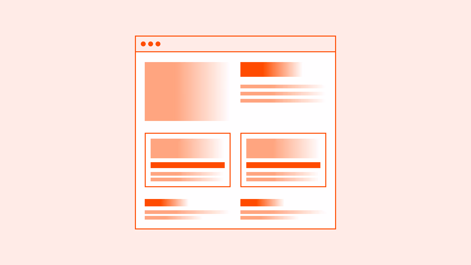
Most modern design systems recommend constraining the maximum width of the main container (often between 1200px and 1440px). This creates balance: the page looks centered, content is easier to scan, and whitespace is used effectively.
Max-width should work alongside responsive breakpoints so layouts adapt smoothly from mobile to widescreen monitors.
Best practices
Guidelines for setting and using a maximum page width effectively.
Use a max-width container for the main layout
Constrain the central content area (commonly 1200–1440px). This keeps text blocks, grids, and visuals readable on wide screens.
References:
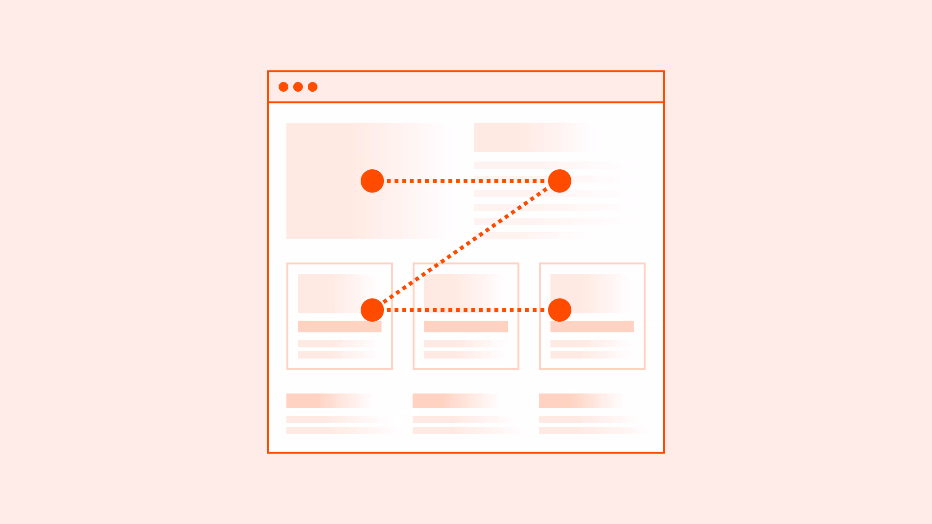
Center content on large screens
Center the main container with equal margins on both sides to maintain balance and prevent edge-stuck layouts.
References:
Adjust width for content type
Text-heavy layouts may benefit from narrower widths (around 1000–1200px), while data tables or media galleries may require wider limits.
References:
Support responsive breakpoints
Ensure max-width integrates with common breakpoints (mobile ~360–480px, tablet ~768px, desktop 1024–1440px+). Avoid horizontal scrolling.
References:
Use relative units where appropriate
Combine px-based max-width with flexible percentages or rem-based spacing for better adaptability across screen densities.
References:
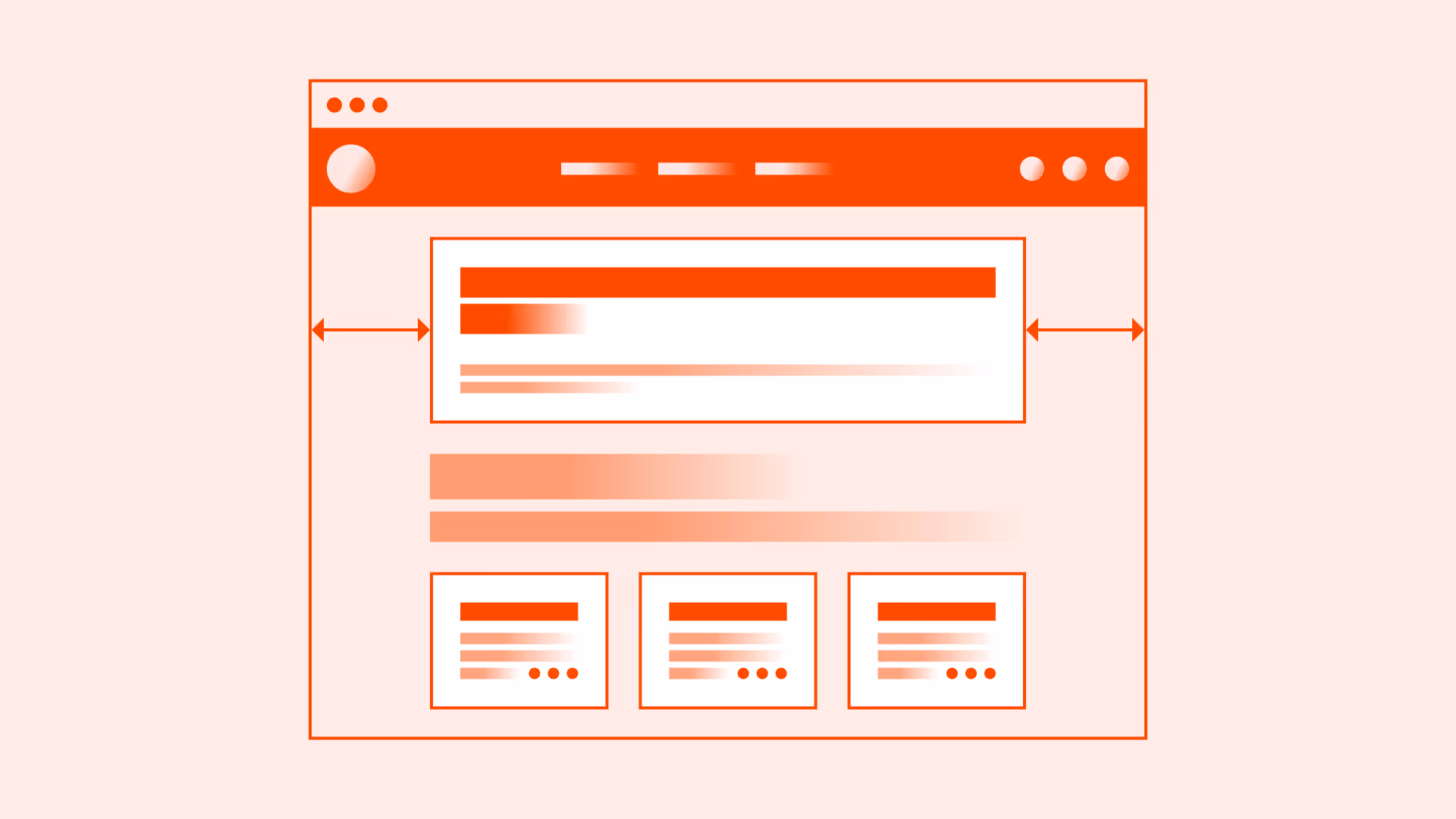
Exceptions: when full-width is appropriate
- Hero sections and promotional banners: Full-width can create immersive visuals at the top of a page, especially with large background images or video.
- Dashboards and data-heavy applications: Wide tables and charts may require edge-to-edge layouts for effective display.
- Multimedia and interactive content: Maps, galleries, and interactive visuals often benefit from full-width presentation.
- Immersive storytelling landing pages: In rare cases, full-width enhances visual impact and emotional engagement.
Common mistakes
Frequent mistakes in setting page width.
No max-width set
Content stretches across ultra-wide monitors, breaking readability and focus.
Using fixed width instead of max-width
Fixed widths prevent responsiveness and can cause overflow on smaller devices.
Too narrow page width
Excessive whitespace leads to unnecessary scrolling and weak visual hierarchy.
Inconsistent breakpoints
Leads to jarring layout jumps or broken compositions between devices.
Summary
Key takeaways for maximum page width.
- Set a max-width for the main page container (commonly 1200–1440px).
- Center content on large screens for balance.
- Adjust width based on content type.
- Integrate with responsive breakpoints and consider relative units.
- Use full-width only for specific cases like hero sections, dashboards, or immersive visuals.
A well-set maximum page width produces layouts that are balanced, readable, and adaptable across devices.
AI prompts
Ready-to-use AI prompts for design agents. Each scenario is pre-loaded with the UX rules from this guide. Copy, adapt to your context, and generate consistent, well-structured output from the start.
Scenario: Content page layout
Use when setting appropriate maximum widths for text-heavy pages, dashboards, or applications to prevent content from stretching uncomfortably on wide screens.