Overview
Users rarely read word by word, they scan. Visual hierarchy, supported by semantic structure, helps them understand what’s most important and where to look next.
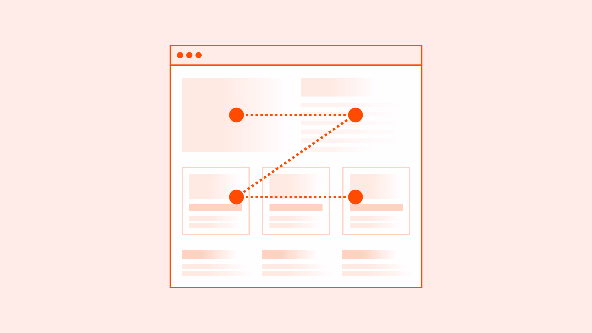
Patterns like the F-pattern (common in text-heavy layouts) and the Z-pattern (common in simple landing pages) describe how users naturally move their eyes across screens.
A strong hierarchy improves readability, orientation, and task completion, while poor hierarchy creates confusion and increases drop-offs.
Best practices
Guidelines for establishing clear hierarchy and supporting natural scanning behavior.
Use headings to establish hierarchy
Structure content with <h1>–<h6> in logical order. Screen readers and scanning users rely on headings to navigate.

References:
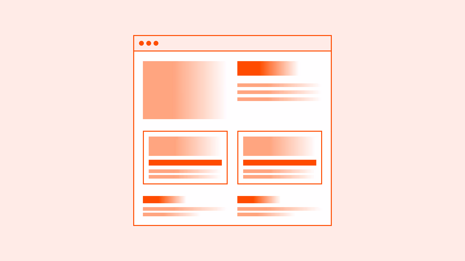
Prioritize informion visually
Use size, weight, color, and spacing to highlight important elements. Ensure differences are accessible (contrast ratios, not just color).

References:
Design for scanning patterns
For text-heavy pages, follow the F-pattern: strong headings, left-aligned text, highlighted keywords. For simple layouts, a Z-pattern with clear entry and exit points can work.
References:
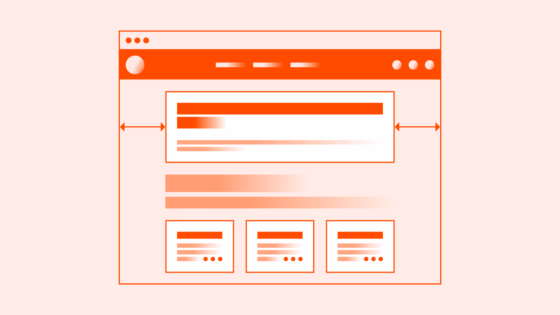
Support hierarchy with layout and whitespace
Group related items visually and semantically. Use spacing, alignment, and grouping to reinforce relationships.
References:
Align visual and semantic hierarchy
Don’t fake hierarchy with styles on <div>. Use real semantic elements (headings, lists, landmarks) so assistive technologies reflect the same structure.
References:
Common mistakes
Frequent mistakes in hierarchy and scanning.
Skipping or misusing heading levels
Inconsistent heading order breaks navigation for screen reader users and harms scanability.
Using styling instead of semantic structure
Bold paragraphs are not a substitute for proper headings and landmarks.
Overloading pages with equally weighted elements
If everything has the same weight, nothing stands out. Establish clear priorities.
Relying only on color to signal importance
Color alone can fail accessibility; pair it with size, weight, and proper contrast.
Summary
Key takeaways for content hierarchy and scanning.
- Establish hierarchy with proper headings and semantic markup.
- Highlight priority content with accessible visual cues (contrast, size, spacing).
- Consider natural scanning patterns (F-pattern, Z-pattern) in layout design.
- Align semantic and visual hierarchy to support all users.
- Avoid overload, hierarchy should clarify, not confuse.
Good content hierarchy reduces effort, improves discoverability, and makes digital experiences faster and more accessible.
AI prompts
Ready-to-use AI prompts for design agents. Each scenario is pre-loaded with the UX rules from this guide. Copy, adapt to your context, and generate consistent, well-structured output from the start.
Scenario: Dashboard or data-heavy page
Use when designing pages with multiple data sections, metrics, or widgets that users scan quickly to extract the most important information.
You are a UX-focused design agent. Design the content hierarchy for a [dashboard type: analytics / project management / e-commerce admin] dashboard.
Rules:
- Establish one primary focal point: the single most critical metric or status
Position: top-left or top-center, largest and most visually prominent element
- F-pattern awareness: place critical information along the top and left edge
Secondary widgets: right column or lower sections
- Three levels of visual weight:
Level 1 (primary): 24–32px, bold, high contrast
Level 2 (secondary): 16–20px, regular or medium weight
Level 3 (tertiary): 12–14px, lighter weight, muted color
- Group related data: financial together, user metrics together, operational together
Separate groups with cards or whitespace (Gestalt proximity)
- Progressive disclosure: show summary first, path to detail on click
KPI card → click → breakdown view
- Every metric needs full context:
✓ "Active users (last 30 days): 1,247"
✗ "1,247"
Accessibility:
- Semantic headings define page structure for screen reader navigation
- Data tables: elements with scope attributes
- Charts: accessible text descriptions or data tables as alternatives
- Color-coded data: always paired with text or icon equivalent
Constraints:
- Never give all metrics equal visual weight
- Never use color alone to distinguish data categories
- Never show numbers without labels and context
Related guides
Explore more guides on similar topics to deepen your understanding and apply best practices consistently.