Overview
Text rarely fits neatly into the boxes we design. User-generated content, dynamic data, or translated text can easily exceed the expected space. Without a clear strategy, this leads to broken layouts, cut-off information, or unreadable UI.
How we handle text overflow directly affects comprehension and usability:
- Truncation preserves layout but risks hiding meaning.
- Wrapping shows the full content but can increase cognitive load if space is limited.
- Scrolling allows full visibility but disrupts flow.
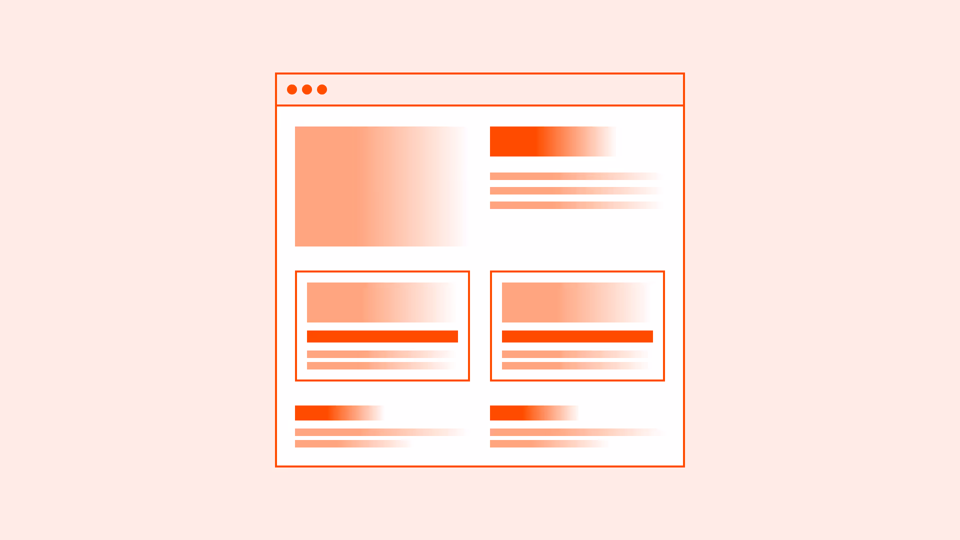
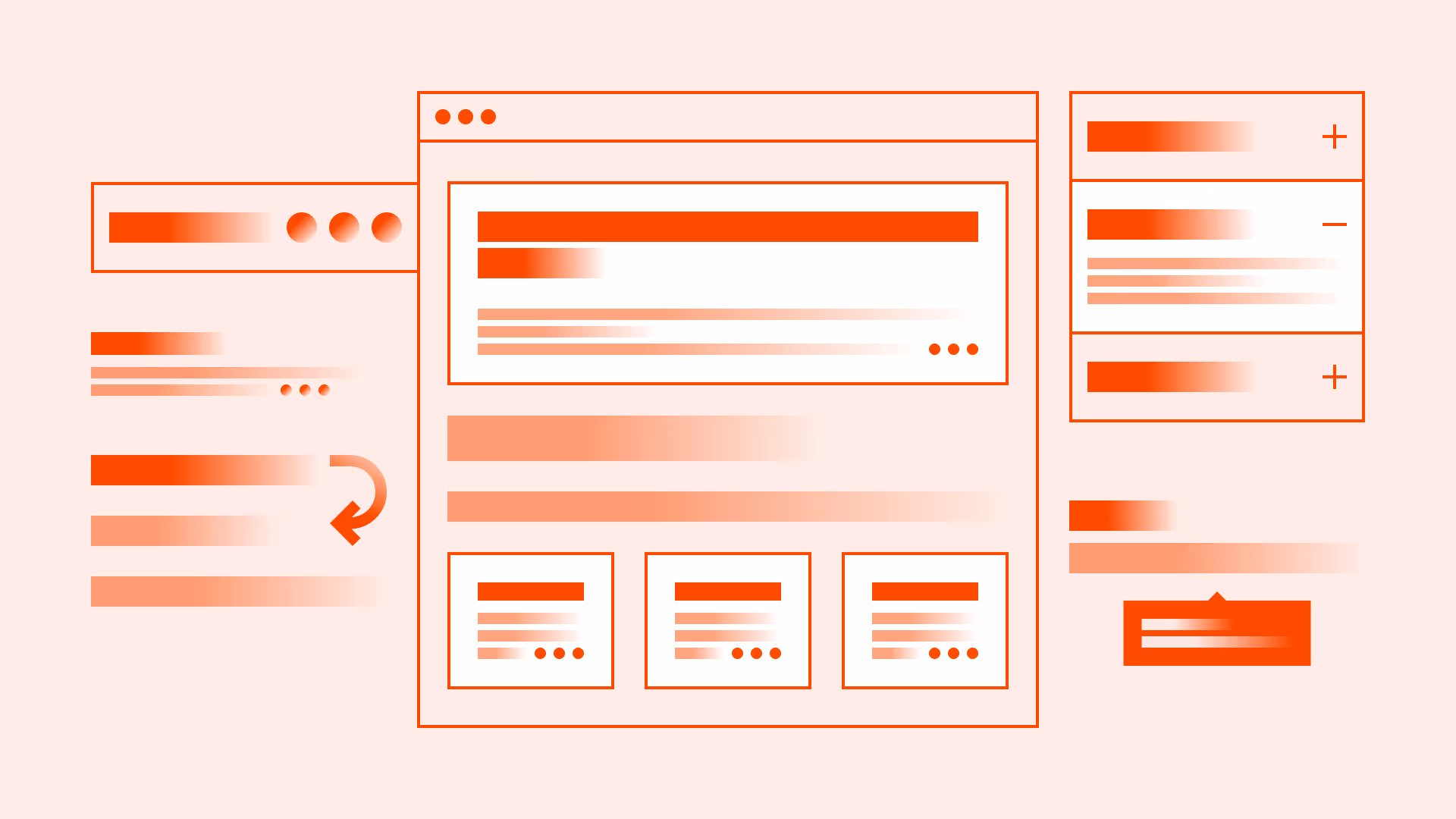
The key is context. Labels, tables, cards, and forms all require different approaches.
Best practices
Principles for handling overflowing text without harming usability.
Prefer wrapping for body content
In paragraphs and longer text blocks, always allow wrapping. Truncation harms readability and accessibility.

References:
Use truncation only when space is limited
Truncation should be a last resort when the UI cannot display the full text due to space constraints (for example: table cells, chat message previews, notification lists). Always indicate truncation with an ellipsis (…) rather than cutting text mid-word. If the full text matters, provide a clear way to access it (tooltip, “View more,” expand/collapse, or a detail view). Also front-load key words so truncated snippets still make sense.
References:
- The importance of tooltips in web accessibility - a11y
- 6 guidelines for truncation design – Baymard Institute
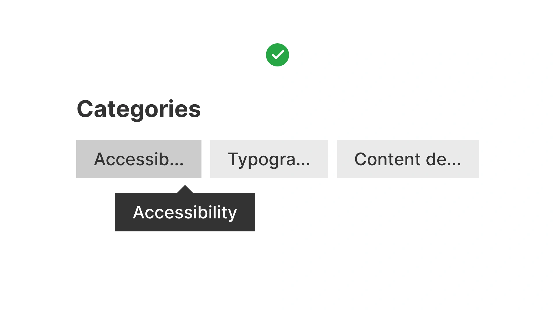
Use truncation with ellipsis for short labels
For UI elements like navigation items, tables, or chips, truncation with an ellipsis (…) maintains layout integrity. Always provide a tooltip, expand option, or accessible label to reveal full content.
References:
Consider scrolling only in special contexts
Scrolling text areas (for example: code snippets or logs) are valid for specialized content but reduce discoverability. Use sparingly and always indicate scroll affordance.
References:
Test with real content and translations
Always test with edge cases: long names, dynamic data, or translated strings. German, Finnish, or Arabic often expand text lengths by 30–50 percent.
References:
Common mistakes
Frequent pitfalls when handling text overflow in interfaces.
Truncating critical content without recovery
Cutting off text (for example: addresses or product names) without a way to see the rest frustrates users.
Wrapping in dense UI elements
Allowing wrapping in navigation menus or table headers clutters layout and harms scanability.
Overusing scrolling areas
Users often miss hidden content in scroll containers unless affordances are obvious.
Ignoring localization
Designing only with English text results in broken layouts once strings expand in other languages.
Using CSS tricks that hide content from screen readers
Some visual truncation methods cut content from the accessibility tree, violating WCAG.
Summary
Text overflow is inevitable. It can be managed with intention.
- Use wrapping for paragraphs and body text.
- Truncate short UI labels, but always provide a way to reveal the full content.
- Apply scrolling only in special cases such as code or logs.
Always test with real-world data and localized strings. Accessibility and clarity must drive the choice, not just visual neatness.
AI prompts
Ready-to-use AI prompts for design agents. Each scenario is pre-loaded with the UX rules from this guide. Copy, adapt to your context, and generate consistent, well-structured output from the start.
Scenario: Table cells and card titles
Use when handling overflow in constrained UI spaces: table cells, card titles, notification lists, or navigation items, where content length is unpredictable.