Overview
The width of a line and the space between lines determine how comfortably users can move through content.
- Too long lines force the eye to travel far, making it harder to track the next line
- Too short lines break the flow, forcing constant jumps
- Too tight line height causes text to feel cramped
- Too loose line height breaks cohesion and slows reading
A balanced line length and line height improve readability, comprehension, and accessibility, making content usable for everyone.
Best practices
Key techniques for setting line length and spacing that improve readability and accessibility.
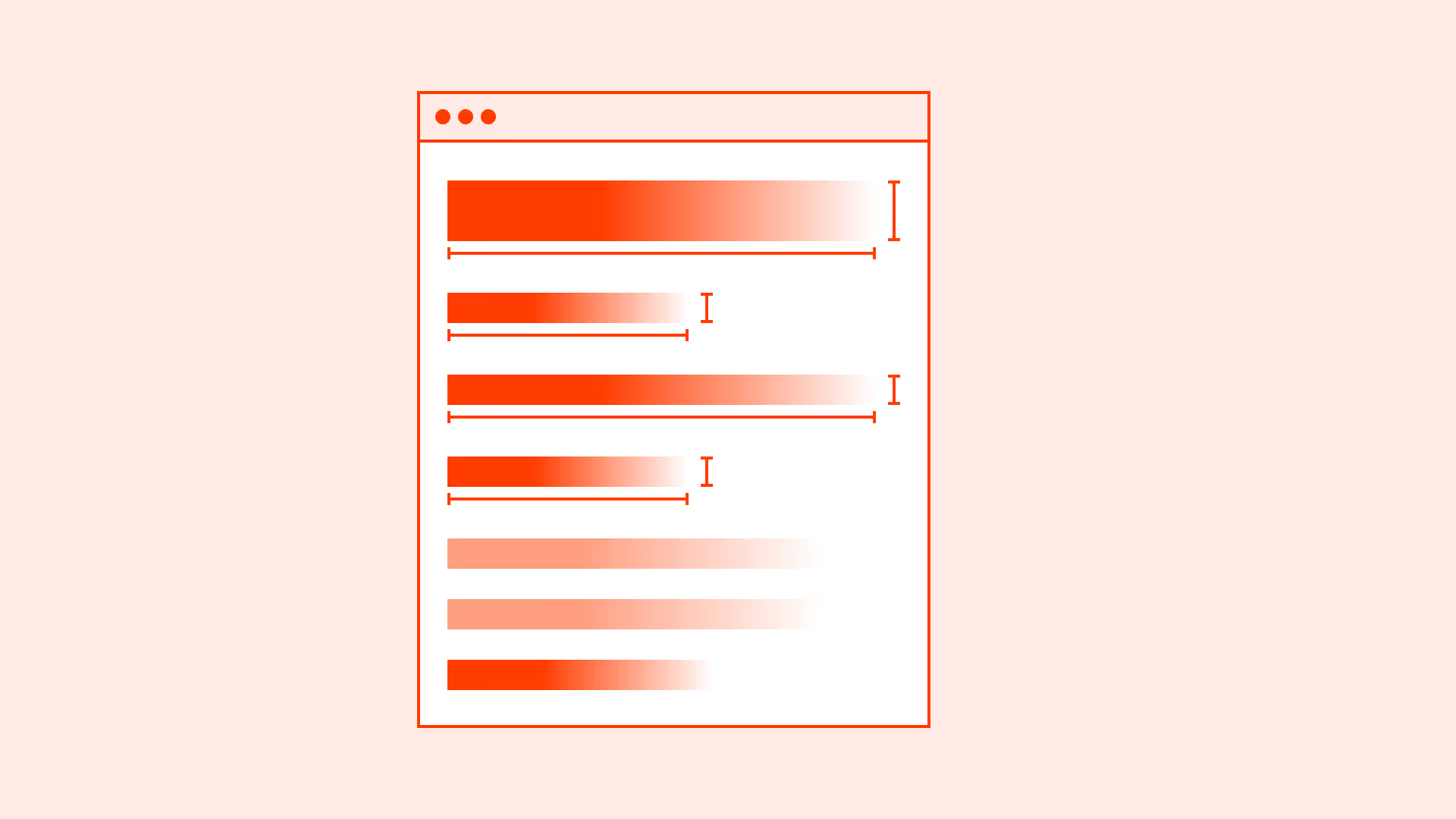
Keep line length within 45–75 characters
The optimal range for body text is 45–75 characters per line (including spaces). This range is backed by research on reading speed and comprehension.

References:
Set line height between 1.4–1.6 for body text
This range gives enough breathing room for comfortable reading without breaking cohesion. For headings, line height can be tighter: 1.1–1.3.
References:
- Typography – Google Material Design
- The elements of typographic style – Robert Bringhurst
Adjust line height per font and context
Different fonts have different x-heights and stroke weights, which affect readability. Always test line height visually and on multiple devices.
References:
- Practical typography – Matthew Butterick
- Thinking with type – Ellen Lupton
Use relative units for line height
Avoid fixed pixel line heights. Use unitless values (for example: line-height: 1.5) so spacing adapts to text size changes.
References:
Common mistakes
Frequent pitfalls that weaken readability when line length and spacing are poorly managed.
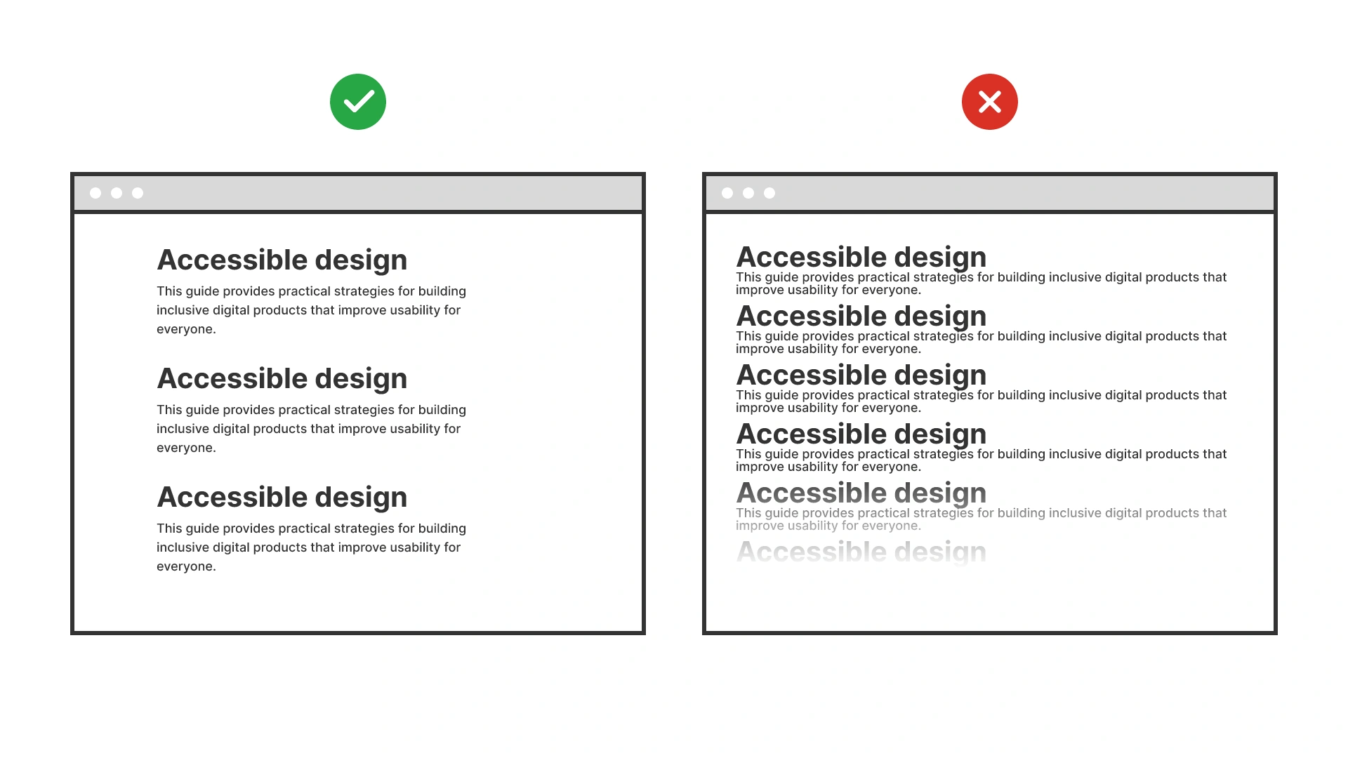
Overly long lines
Lines longer than 90–100 characters reduce comprehension and increase eye fatigue.
Lines too short
Text blocks narrower than 35 characters feel choppy and break reading flow.

Tight line spacing
Line-height: 1.2 or less makes text cramped and inaccessible, especially for users with low vision or dyslexia.
Excessive line spacing
Line-height: 2 creates “text islands” and slows reading.
Summary
Line length and line height define the rhythm of reading. Stick to 45–75 characters per line, pair with a line height of 1.4–1.6 for body text, and keep headings tighter.
Balance improves readability, reduces cognitive load, and supports accessibility across devices.
AI prompts
Ready-to-use AI prompts for design agents. Each scenario is pre-loaded with the UX rules from this guide. Copy, adapt to your context, and generate consistent, well-structured output from the start.
Scenario: Reading experience optimization
Use when setting line length and line height for any text-heavy interface: articles, documentation, forms, or dashboards, where readability directly affects comprehension.