Overview
Capitalization directly impacts how quickly and accurately users read.
- Sentence case mirrors natural language, making content easier to scan and comprehend
- Title Case can feel more formal or promotional, but it slows reading in interfaces
- ALL CAPS reduces word shape recognition, harming readability, especially for users with dyslexia or low vision
A consistent, intentional approach to case style improves accessibility and strengthens brand clarity.
Best practices
Key principles for choosing and applying case styles in interfaces.
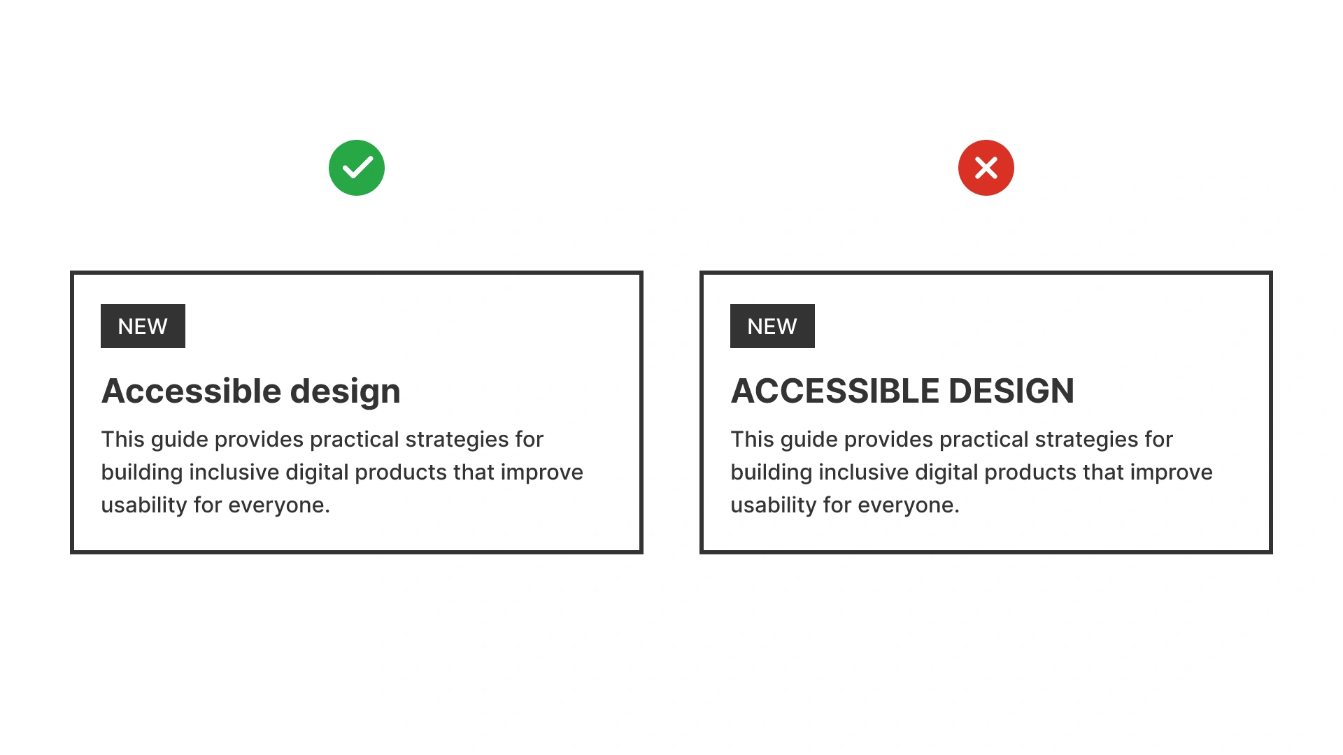
Prefer sentence case for UI text
Sentence case (capitalize only the first word and proper nouns) is the most readable and accessible style. It supports users with dyslexia by preserving familiar letter shapes and reduces cognitive load in navigation, forms, and buttons.

References:
Use title case sparingly
Title Case can be effective for page titles, marketing headers, or editorial content. Avoid it in functional UI (navigation, labels) where speed of scanning matters most.
References:
Reserve all caps for short, high-emphasis labels
ALL CAPS reduces readability for longer text but can work for short tags, acronyms, or CTAs (“SAVE”, “NEW”). Always test contrast and legibility.
References:
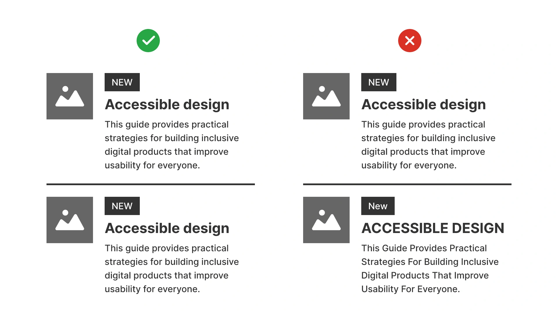
Maintain consistency across the product
Mixing case styles arbitrarily (for example: sentence case in some menus, title case in others) weakens hierarchy and confuses users. Define case usage in the design system.
References:
Common mistakes
Frequent pitfalls when case styles are misused in digital products.
Overusing all caps
Long sentences in all caps are harder to read, inaccessible for dyslexia, and feel like shouting.
Inconsistent case across UI
Switching between sentence case and title case for similar elements breaks consistency.
Using title case for functional labels
It slows down scanning in navigation, buttons, and forms.
Summary
Case style directly shapes user experience.
- Sentence case is the best choice for accessibility and clarity in interfaces.
- Title Case works in editorial and marketing contexts but should be used sparingly in UI.
- ALL CAPS should be reserved for very short labels or acronyms.
Consistency across the product is critical. Users shouldn’t have to “decode” style differences.
AI prompts
Ready-to-use AI prompts for design agents. Each scenario is pre-loaded with the UX rules from this guide. Copy, adapt to your context, and generate consistent, well-structured output from the start.
Scenario: UI text case audit
Use when auditing or establishing text case conventions across an interface. Inconsistent case mixing creates visual noise and reduces professionalism.