Overview
Validation is how forms communicate correctness. Inline validation, when implemented well, reduces frustration and speeds up form completion. Instead of discovering multiple errors only after submission, users receive guidance field by field, in real time.
Done poorly, inline validation can overwhelm or distract, but when designed with care it becomes a powerful tool to improve usability, accessibility, and trust.
Best practices
Guidelines for implementing inline validation effectively.
Validate at the right moment
Run validation after the user leaves the field, or after input stabilizes, not while typing every character. Real-time validation for complex inputs (like passwords) can cause unnecessary stress.

References:
Provide clear, actionable error messages
Error messages must explain what went wrong and how to fix it. Avoid generic phrases like “Invalid input”. Instead: “Password must be at least 8 characters”.
References:
Confirm success as well as errors
Positive reinforcement helps users feel confident. Use clear success states (for example: green checkmark) when input passes validation.
Positive inline validation removes some cognitive load from users since they don’t have to review and validate the form for errors before submitting it.

References:
Ensure validation messages are accessible
Associate messages programmatically with fields using aria-describedby. Screen readers should announce both the input and the validation result.
Messages must meet contrast requirements WCAG 1.4.3: Contrast minimum.
References:
Use inline hints for formatting requirements
Show rules before users type (for example: “Password must include at least one number”). This prevents errors instead of only reporting them.
References:
- Designing UX: Forms – Jessica Enders
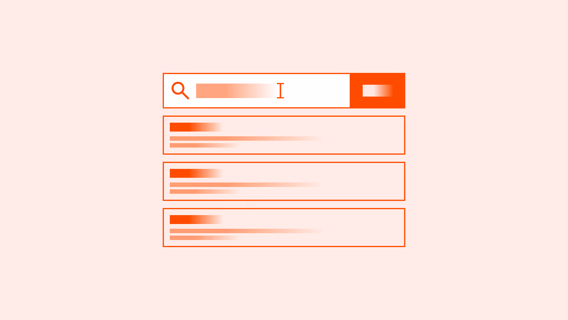
Keep validation messages close to the field
Errors should appear immediately below or beside the input. Users shouldn’t have to hunt across the page to understand the issue.
Common mistakes
Frequent mistakes when implementing inline validation.
Validating while typing every character
Distracts users and often highlights “errors” mid-entry (for example: typing the first character of an email).
Using vague or technical error messages
“Error 503” or “Invalid input” provides no guidance for fixing the issue.
Showing only error states, not success
Leaves users uncertain if their input was accepted.
Placing error messages far from the field
Forces users to scroll or search for context.
Summary
Key takeaways for inline validation.
- Validate inputs at the right moment, not too early, not too late.
- Make error messages clear, actionable, and accessible.
- Reinforce success as well as highlighting errors.
- Keep validation messages close to their fields.
- Anticipate errors with inline hints to reduce mistakes before they happen.
Good inline validation balances prevention, guidance, and reassurance, making forms smoother, faster, and more trustworthy.
AI prompts
Ready-to-use AI prompts for design agents. Each scenario is pre-loaded with the UX rules from this guide. Copy, adapt to your context, and generate consistent, well-structured output from the start.
Scenario: Toolbar with icon actions
Use when designing a row of icon buttons in a toolbar: text editors, image editors, data table toolbars, where space constraints make icon-only buttons necessary.
