Overview
Focus states are essential for users navigating with keyboards, screen readers, or other assistive technologies. They indicate which element is currently active and ready for interaction.
Without proper focus indicators, users can get lost, make mistakes, or be blocked from completing tasks. Even mouse users benefit from visible focus when switching between inputs, forms, or buttons.
Focus states are not just a compliance requirement, they are a fundamental UX element that improves orientation, confidence, and efficiency.
Best practices
Guidelines for designing focus states.
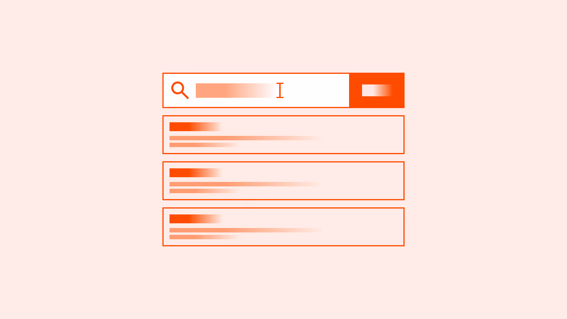
Always provide visible focus indicators
Every interactive element (links, buttons, inputs) must have a visible focus style distinct from hover or active states. Do not remove the browser’s default outline without providing a clear replacement.

References:
Use strong visual indicators
Focus states should be high-contrast and clearly visible against all backgrounds. Examples: outlines, underlines, background changes.
References:
Ensure keyboard navigation order is logical
Focus should move in the same order as the visual layout. Test with the Tab key to ensure predictable flow.
References:
Differentiate focus from hover
Users navigating with both mouse and keyboard must clearly distinguish focus from hover states.

References:
Maintain focus context after dynamic updates
When content updates (modals, accordions, infinite scroll), keep focus in context or move it logically (for example: to the modal header).
References:
Support custom focus styles in design systems
Define consistent focus tokens in your design system to ensure alignment across products.
References:
Common mistakes
Frequent mistakes in focus state design.
Removing default focus outlines without replacement
Leaves keyboard users without orientation.
Low-contrast focus indicators
Subtle glows or faint borders often fail WCAG contrast requirements.
Skipping elements in focus order
Custom components that don’t follow DOM order confuse screen reader and keyboard users.
Moving focus unpredictably
Jumping focus to unrelated areas after actions (for example: back to the top of the page) disorients users.
Summary
Key takeaways for focus states.
- Every interactive element must have a visible, high-contrast focus state.
- Keyboard navigation order should be logical and predictable.
- Focus must remain consistent during dynamic updates.
- Never remove focus outlines without providing an accessible alternative.
Strong focus states help users stay oriented, confident, and efficient. Weak or missing ones block access entirely.
AI prompts
Ready-to-use AI prompts for design agents. Each scenario is pre-loaded with the UX rules from this guide. Copy, adapt to your context, and generate consistent, well-structured output from the start.
Scenario: Custom focus indicators
Use when designing focus states that replace browser defaults while remaining accessible: for products with custom design systems or brand-specific styling.
