Empty states are often overlooked but critically important. Learn how to design empty states that guide users, set expectations, and encourage the next action instead of leaving them confused.
Overview
Instead of leaving screens blank or with a generic “No data” message, thoughtful empty states help users understand why the screen is empty, what to expect once it’s filled, and how to move forward.
A poorly designed empty state creates confusion or the impression that something is broken. A good one reduces uncertainty and builds trust.
Best practices
Guidelines for designing helpful, accessible empty states.
Explain the context
Importance:
Critical
Tell users why the state is empty (for example: “You don’t have any saved items yet”). This reduces confusion.
Leaves users confused about what to do or whether something is broken.
Providing no actions
Importance:
Critical
Without a clear next step, users can’t proceed.
Overloading with decorative visuals
Importance:
Recommended to avoid
Visuals that add no clarity distract from purpose and slow task completion.
Using a negative or blaming tone
Importance:
Recommended to avoid
Harsh phrasing damages trust and discourages engagement.
Summary
Key takeaways for empty states.
Explain context so users understand why the screen is empty.
Always provide a clear next action.
Use previews and visuals to set expectations.
Keep tone supportive and encouraging.
Good empty states reduce uncertainty and promote engagement.
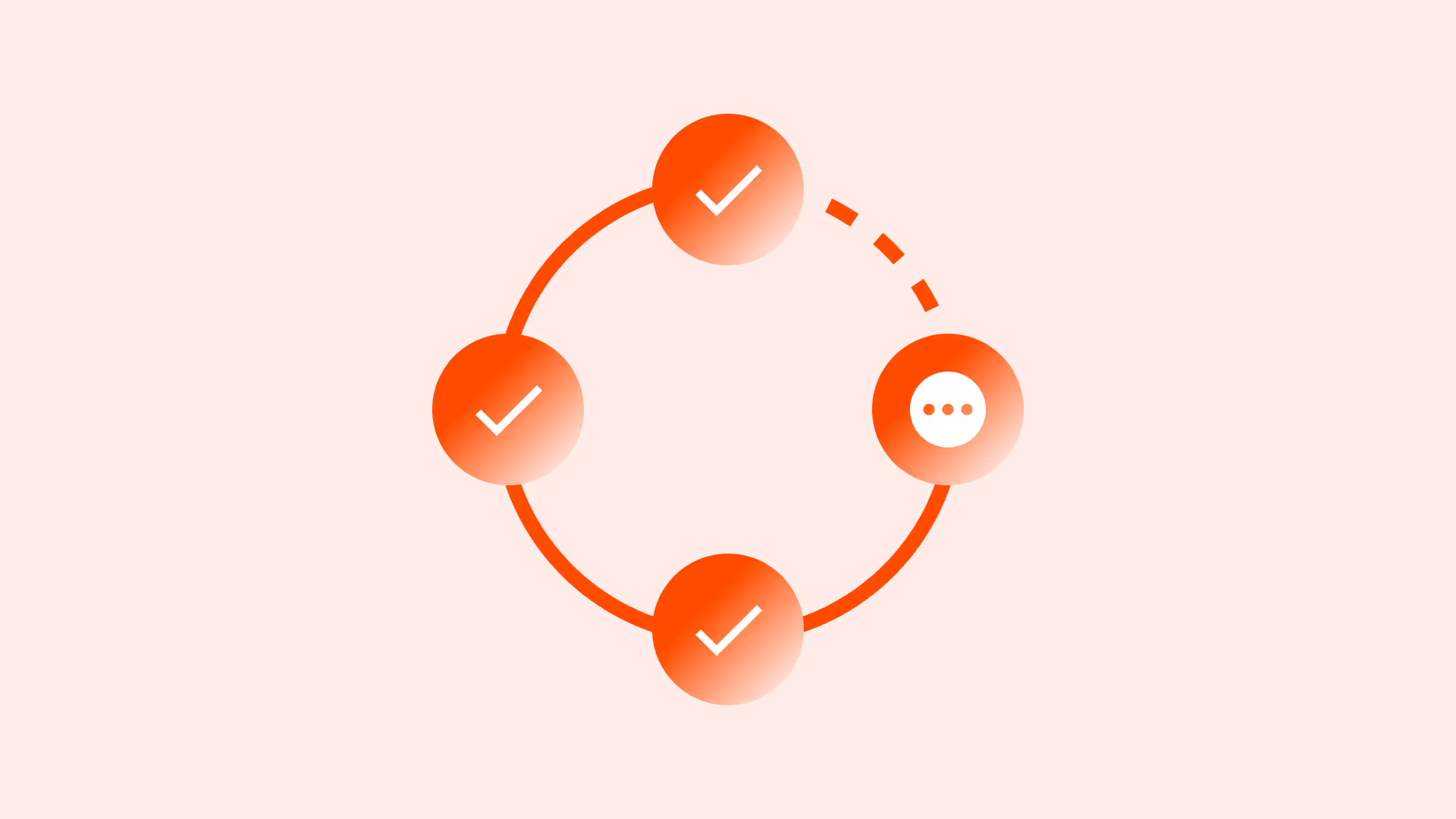
AI prompts
Ready-to-use AI prompts for design agents. Each scenario is pre-loaded with the UX rules from this guide. Copy, adapt to your context, and generate consistent, well-structured output from the start.
Scenario 1: First-use (no data yet)
Use when a user has just signed up or created something new and the screen has no content yet. The goal is to orient them and prompt the first meaningful action.
AI prompt
You are a UX-focused design agent. Design a first-use empty state for [screen name: projects list / inbox / saved items / team members] in a [product type].

Rules:
- Headline: tell the user this screen is empty because they haven't added anything yet — not because something broke
  ✓ "You don't have any projects yet"
  ✗ "No data" ✗ blank screen
- Body: 1–2 sentences describing what this screen will contain once populated
  "Your projects will appear here — each with a status, deadline, and team."
- Primary CTA: one specific action that creates the first item
  ✓ "Create your first project" ✓ "Add a team member"
  ✗ "Get started" ✗ "Click here"
  Style: primary button, 44×44px minimum touch target
- Secondary action (optional): "Import from CSV", "Watch a 2-minute tour", "Invite teammates"
  Style: text link or secondary button — never as prominent as the primary CTA
- Illustration: optional, must not replace or obscure the message and CTA
  If removed, the state must still be fully functional and clear

Accessibility:
- All meaning must be conveyed in text — not only through illustration
- CTA button: descriptive accessible label
- Minimum 4.5:1 contrast for all text

Constraints:
- Never show a blank screen
- Never show only "No data" or "Nothing here yet" without a next action
- Never make the illustration the dominant element — content and CTA come first
- Never add more than 2 actions — one primary, one secondary maximum
Scenario 2: No search results
Use when a user has performed a search or applied filters and nothing matched. The screen is empty because of their input, not because there's no data.
AI prompt
You are a UX-focused design agent. Design a no-results empty state for a [search / filter] interface in [product context].

Rules:
- Show the user's query or active filters in the message — acknowledge what they searched for
  ✓ "No results for 'blue running shoes' in Women's Footwear"
  ✗ "No results found"
- Recovery actions — in this priority order:
  1. Clear or adjust filters (if filters are active): prominent "Clear filters" button
  2. Broaden the search: "Search all categories" or "Remove one filter at a time"
  3. Check spelling (only for free-text search): subtle hint, not a primary message
  4. Fallback content: show 3–5 popular or recommended items below the empty state
- Tone: helpful, not apologetic
  ✓ "Try adjusting your filters to see more results"
  ✗ "Sorry, nothing matched your search"
- Keep the user's query visible and editable in the search field

Accessibility:
- aria-live="polite" on the results container — announce the empty state to screen readers
- All recovery action buttons: keyboard operable with descriptive labels
- Do not rely on color alone to communicate the empty state

Constraints:
- Never show a dead end — always provide at least one recovery action
- Never auto-clear the user's query after showing the empty state
- Never show more than 2 recovery actions at once — prioritize the most effective one
- Never say "Sorry" — empathetic but not apologetic
Scenario 3: Error state (failed to load)
Use when content couldn't be retrieved due to a network error, server issue, or timeout. The screen is empty not because there's no data, but because loading failed.
AI prompt
You are a UX-focused design agent. Design an error empty state for [screen name] when content fails to load due to a network error, server issue, or timeout.

Rules:
- Distinguish this clearly from first-use or no-results states — the copy must communicate a loading failure
  ✓ "We couldn't load your projects — this might be a temporary issue"
  ✗ "No projects yet" (implies no data, not a load failure)
- Primary action: "Try again" or "Reload"
  Triggers the data fetch again, 44×44px minimum, keyboard operable
- Secondary action (for persistent errors): "Contact support" or "Check your connection"
- Tone: calm, factual, reassuring
  ✓ "This is usually temporary — try refreshing in a moment"
  ✗ "Critical error" ✗ "Something went horribly wrong"
- If cached/stale data is available: show it with a banner indicating it may be outdated
  This is always preferable to a fully blank screen
- Never expose error codes, HTTP status numbers, or stack traces

Accessibility:
- aria-live="assertive" — this is unexpected and requires immediate attention
- Error message must not auto-dismiss — keep it until the user takes action
- Retry button: keyboard operable, focused after error appears

Constraints:
- Never show the same design for error states as for first-use or no-results
- Never leave the screen without a retry action
- Never expose technical error codes to users
- Never auto-dismiss the error message
Scenario 4: Filtered to zero
Use when a user has applied filters to a list that previously had items, and the current filter combination returns nothing, the list was not empty before.
AI prompt
You are a UX-focused design agent. Design a "filtered to zero" empty state for a [product listing / task list / report / content feed] with active filters.

Rules:
- The copy must acknowledge that filters caused the empty state — not that data doesn't exist
  ✓ "No items match your current filters"
  ✗ "No results found"
- Show all active filters prominently — users must see exactly what they applied
- Individual filter removal: × button on each active filter chip
  aria-label="Remove filter: In Stock" — not just "×"
- "Clear all filters": secondary action, below or beside individual removal controls
  Never make this the only option — users need granular control
- Item count hints (if technically feasible):
  "Remove 'In Stock' to see 24 more items"
- Never automatically remove or reset filters when zero results occur

Accessibility:
- Each filter removal button: descriptive aria-label
- Empty state message: aria-live="polite" when it appears
- Result count update after filter removal: announced to screen readers

Constraints:
- Never auto-reset filters when zero results occur
- Never show only "Clear all" without individual filter removal options
- Never hide which filters are active when the empty state is shown
- Never use the same copy as the no-search-results state — the cause is different