Error messages in forms

September 12, 2025

Error messages in forms should guide, not blame. Clear, actionable, and accessible feedback helps users recover quickly and complete tasks with confidence.

Overview

Errors are inevitable, but frustration doesn’t have to be. The way you design error messages in forms determines whether users feel supported or defeated. A poorly written or misplaced message can cause confusion, break trust, and lead to abandonment.

Good error messages do more than signal a problem. They explain what went wrong, how to fix it, and do so in a respectful and inclusive tone. Done right, error messages become a natural extension of form usability and accessibility.

Best practices

Guidelines for writing and placing error messages in forms.

Write clear, specific, and actionable messages

Importance:
Critical

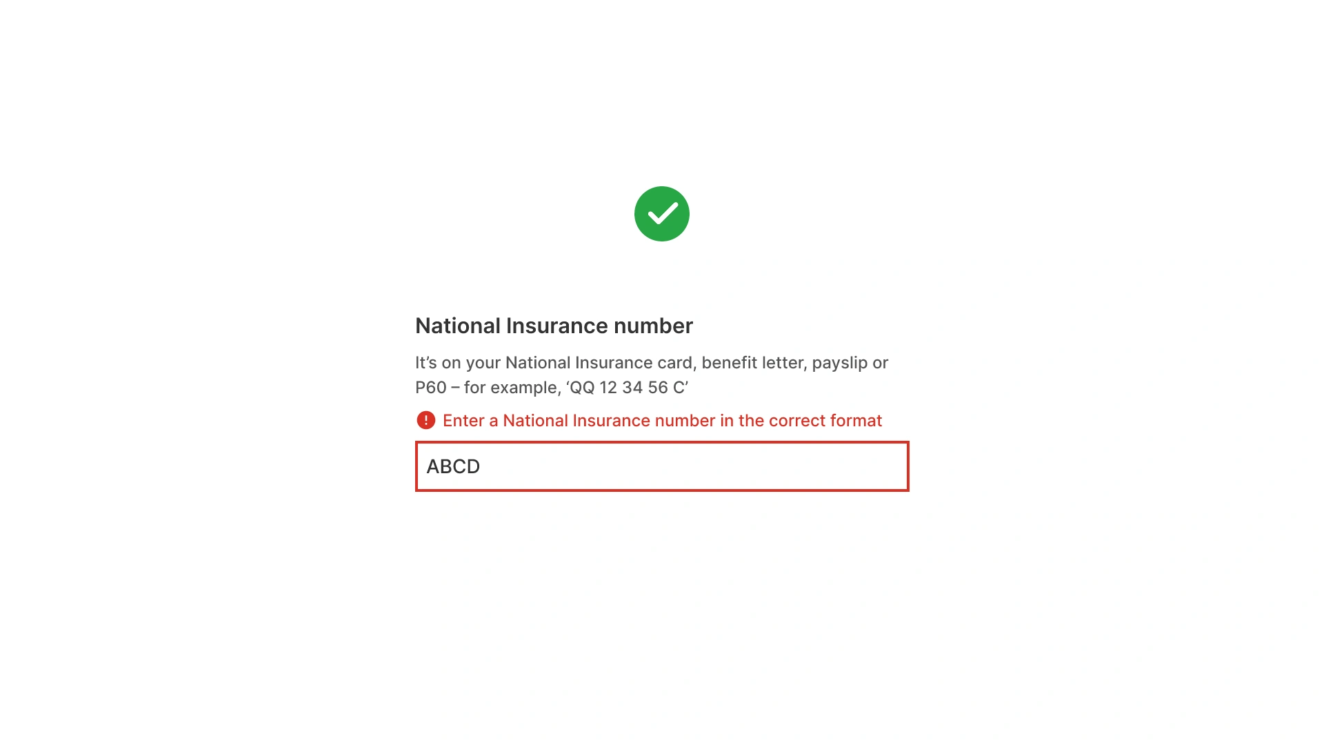
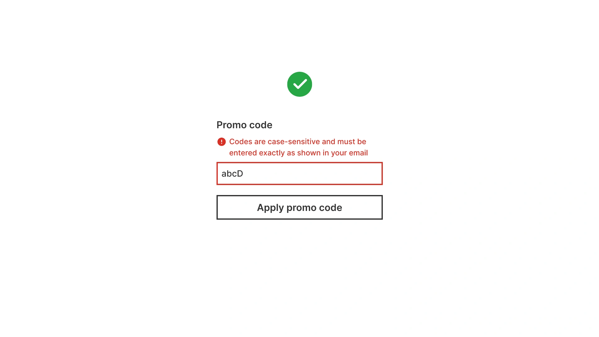
Avoid vague errors like “Invalid input”. Instead, describe what is wrong and how to correct it: “The security code (CVV) should be 3 digit from the back of your card”.

Good: clear NI number instructions; bad: vague “Error” message

References:

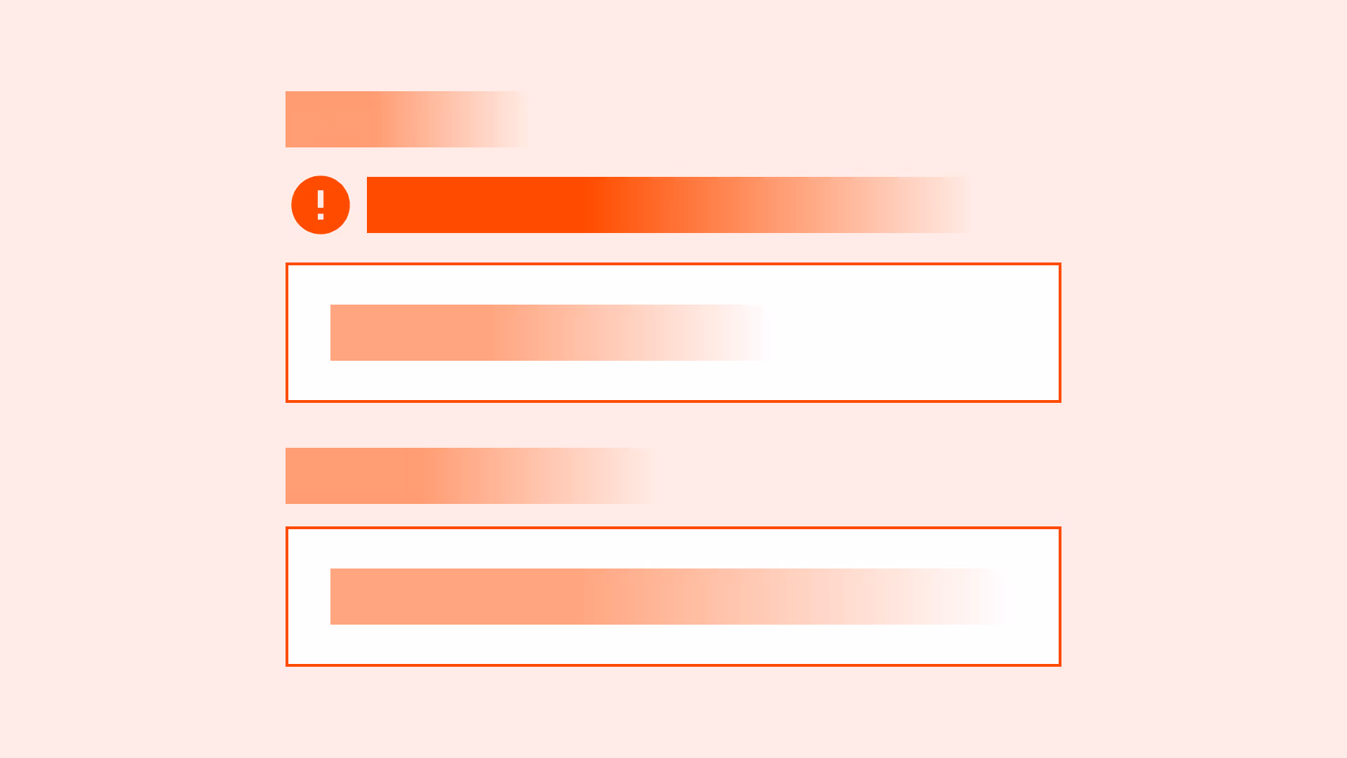
Place error messages close to the field

Importance:
Critical

The error message should be displayed above the input field box, directly below the input field label and any helper text (if present).

References:

Use a helpful, non-blaming tone

Avoid language that makes users feel at fault (“You entered this wrong”). Use neutral, supportive phrasing (“Please enter a valid email address”).

References:

Ensure accessibility for all error messages

Importance:
Critical

Associate errors programmatically with fields using aria-describedby. Screen readers should announce both the field and the error.

Error text must meet WCAG 1.4.3 contrast requirements.

References:

Do not rely on color alone

Importance:
Critical

Always supplement color with an additional indicator (for example: an error icon) when displaying errors, to ensure clarity and accessibility.

NI number field with red error and icon — shows errors shouldn’t rely on color alone

References:

Offer recovery guidance when possible

When errors relate to complex formats, provide examples of correct input alongside the error message.

Promo code field shows error: codes are case-sensitive and must match exactly

References:

Common mistakes

Frequent mistakes in error message design.

Using generic or technical error codes

Importance:
Critical

“Error 503” or “Something went wrong” gives no direction for fixing the issue.

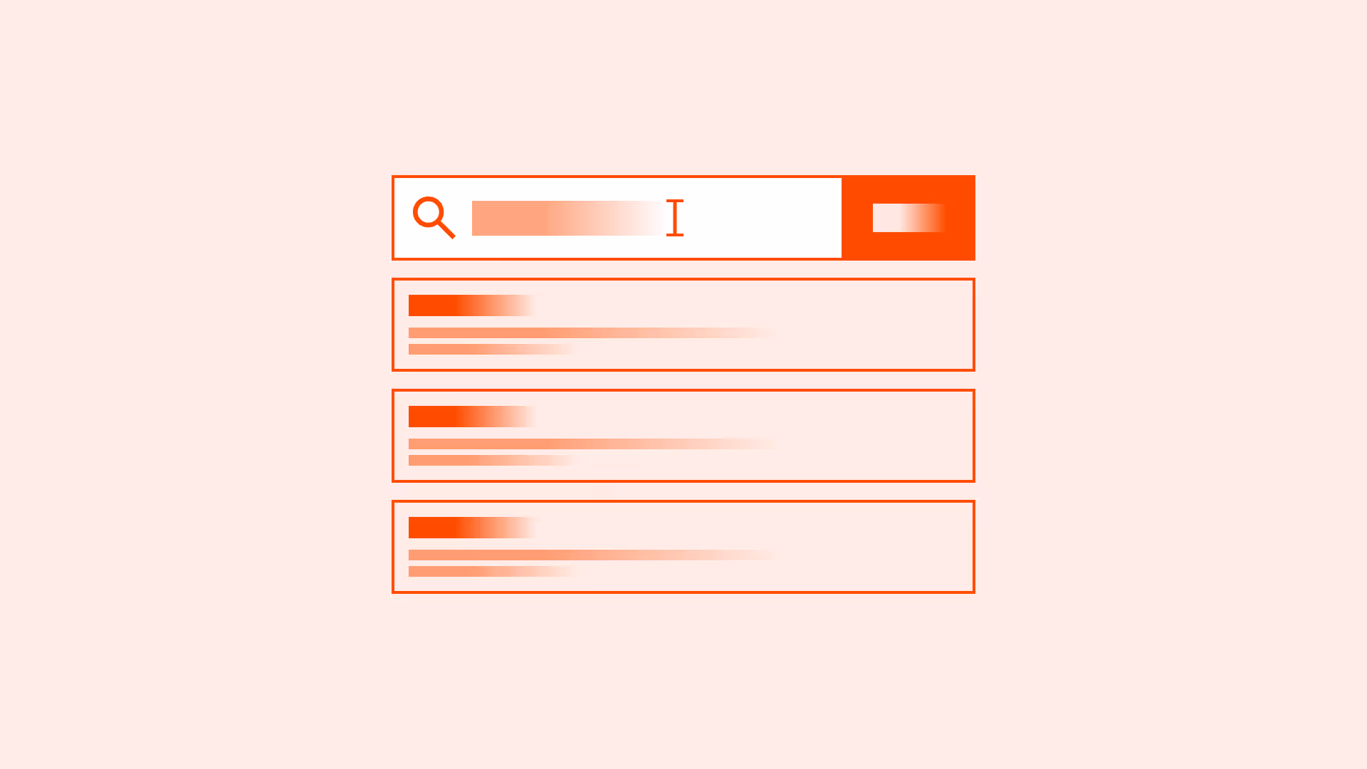
Displaying all errors only after submission

Importance:
Critical

Forces users to hunt through the entire form instead of fixing issues as they go.

Relying only on red borders

Importance:
Critical

Fails accessibility and leaves users guessing what is wrong.

Blaming the user in error wording

Increases frustration and damages trust.

Summary

Key takeaways for error messages in forms.

  • Error messages should be clear, actionable, and respectful.
  • Place them near the field for context and faster recovery.
  • Ensure accessibility with proper contrast, programmatic labels, and text beyond color.
  • Support users by guiding them to fix issues, not just pointing them out.

Thoughtful error messages transform frustration into clarity, making forms more usable, inclusive, and trustworthy.

AI prompts

Ready-to-use AI prompts for design agents. Each scenario is pre-loaded with the UX rules from this guide. Copy, adapt to your context, and generate consistent, well-structured output from the start.

Scenario 1: Field-level error messages

Use when writing the specific error copy that appears below a form field after validation fails: the message the user reads to understand what went wrong and how to fix it.

AI prompt
You are a UX-focused design agent. Write field-level error messages for a [form type: registration / payment / shipping / profile] form.

Rules:
- Error message formula: [what went wrong] + [how to fix it]
  ✓ "Email must include an @ — for example, you@example.com"
  ✓ "Password must be at least 8 characters — add 3 more"
  ✗ "Invalid email" ✗ "Error in field 3"
- Write a separate message for every failure mode per field:

  Email:
  - Empty: "Please enter your email address"
  - No @: "Email must include an @ — for example, you@example.com"
  - Already registered: "An account with this email already exists. [Sign in] or [Reset password]"

  Password:
  - Empty: "Please create a password"
  - Too short: "Password must be at least 8 characters — add [X] more"
  - Missing number: "Add at least one number to your password"

  Phone:
  - Empty: "Please enter your phone number"
  - Too short: "Phone number is incomplete — check for missing digits"

- Tone: never blame the user
  ✓ "This email address isn't valid"
  ✗ "You entered an invalid email address"
- Placement: directly below the field — never in toasts or top-of-page banners
- Visual: red text + error icon + red border — never color alone
- Minimum font size: 14px, minimum contrast: 4.5:1

Accessibility:
- aria-describedby on input pointing to error message element
- aria-invalid="true" on the field
- role="alert" or aria-live="polite" on the error message container

Constraints:
- Never write "Invalid [field name]" without explaining what's wrong
- Never use the same message for different types of errors in the same field
- Never put field-level errors in toasts or notification banners

Scenario 2: System-level error messages

Use when an error occurs at the form or application level: server failures, network timeouts, card declines, or permission issues not caused by user input.

AI prompt
You are a UX-focused design agent. Design system-level error messages for [context: payment form / file upload / API integration / account creation].

Rules:
- Message formula: [what happened] + [why if known] + [what the user can do]
  ✓ "Your payment didn't go through. Your card may have insufficient funds. [Try a different card] or [Contact your bank]"
  ✗ "Payment failed" ✗ "Error 500"
- Categories and copy:

  Network / timeout:
  "We couldn't connect. Check your internet connection and [try again]."

  Server error (temporary):
  "Something went wrong on our end. This is usually temporary — [try again] in a moment."

  Business rule (card declined):
  "Your card was declined. Check the card number, expiry date, and CVV, then [try again] or [use a different card]."

  Session expired:
  "Your session has expired. [Sign in again] to continue — your progress has been saved."

- Every system error must include at least one action: Try again / Use alternative / Contact support
- Placement: prominent banner above the form — not at the bottom
- Error must stay visible — never auto-dismiss critical errors
- For support-required errors: include a reference ID — "Reference: ERR-20250326-4821"
- Never expose HTTP status codes or stack traces

Accessibility:
- Dynamic errors: aria-live="assertive"
- Error container receives keyboard focus or is adjacent to the action button

Constraints:
- Never show raw error codes to users
- Never auto-dismiss critical error messages
- Never write "Something went wrong" without more context and a next action