Overview
Humans have limited working memory. Long, unstructured blocks of text or data quickly overwhelm users, leading to frustration and missed information.
By chunking content into sections, lists, and visual groups, you align with how people naturally process information. This makes reading, decision-making, and task completion smoother.
Best practices
Guidelines for chunking information to improve readability and comprehension.
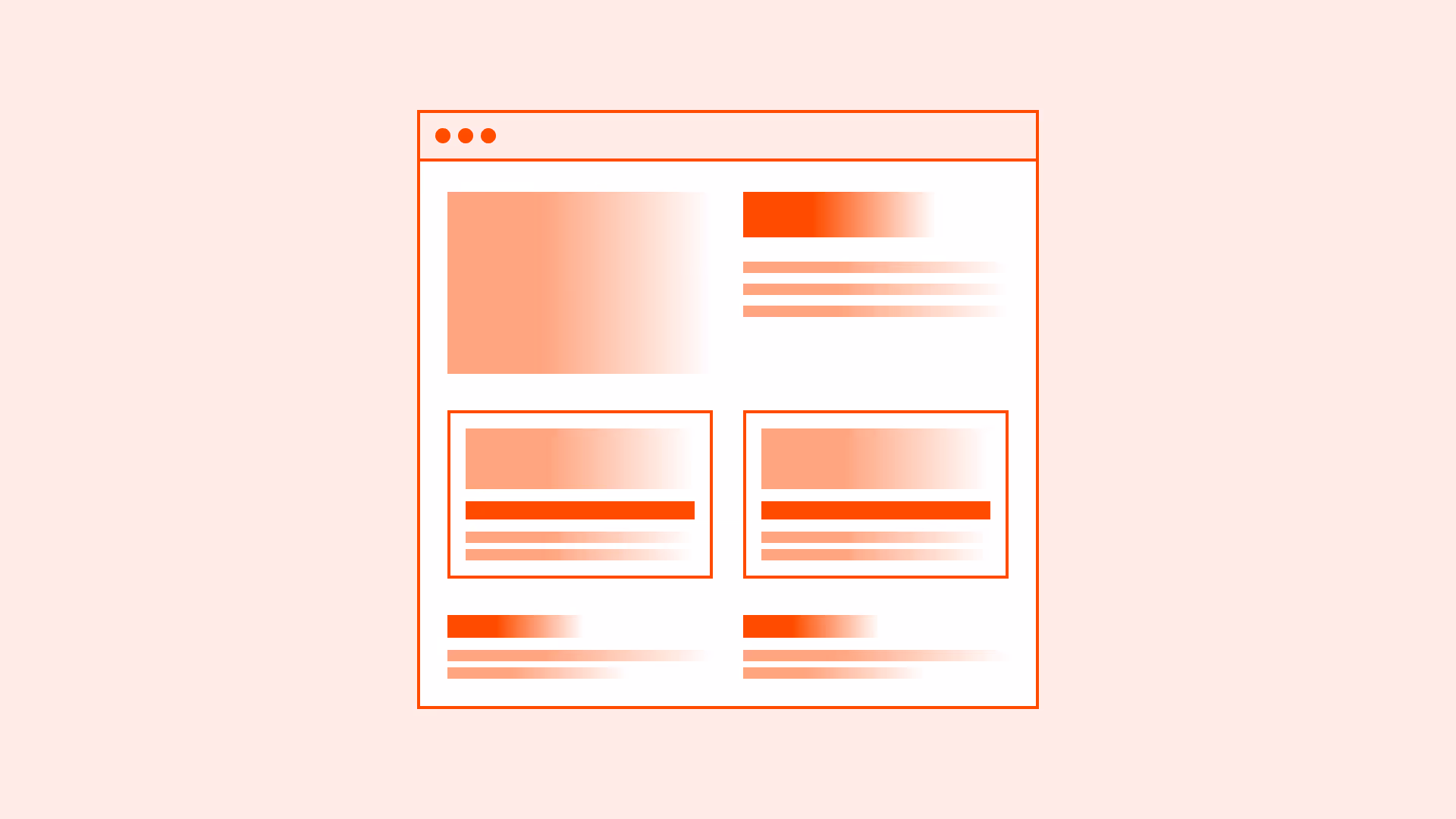
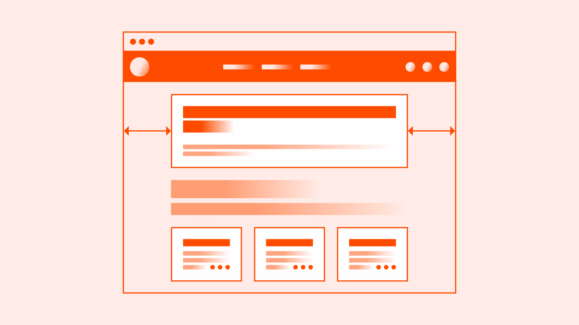
Break content into logical sections
Divide long content into meaningful groups with headings or dividers. Each section should focus on a single idea.
References:
Use headings and subheadings
Headings guide readers and screen readers alike. They improve orientation and scanning.
References:
Present lists instead of long paragraphs
Bulleted or numbered lists make items easier to scan and remember compared to dense text.
References:
Keep paragraphs short and focused
Keep paragraphs to 2–4 sentences for readability, especially on mobile screens.
References:
Support with visual grouping and spacing
White space, borders, and background color can visually separate chunks and reduce cognitive load.
Combine text with visuals when useful
Diagrams, icons, or images can reinforce meaning and break monotony when paired with text.
References:
Common mistakes
Frequent mistakes when chunking information.
Presenting long unbroken walls of text
Dense text blocks overwhelm users and hide key points.
Using vague or missing headings
Without clear headings, users and assistive technologies can’t navigate effectively.
Mixing unrelated topics in one section
Each chunk should cover one idea to avoid confusion.
Overloading lists with too many items
Group or paginate long lists to keep them scannable.
Ignoring spacing, making chunks blend together
Insufficient whitespace reduces clarity and increases cognitive load.
Summary
Key takeaways for chunking information.
- Break content into clear, logical sections with headings.
- Use lists and short paragraphs to support scanning.
- Apply whitespace and visual grouping for clarity.
- Pair text with visuals when helpful.
- Avoid overwhelming users with dense, unstructured content.
Chunking respects human memory limits and reading behavior, making information more accessible, engaging, and easy to act upon.
AI prompts
Ready-to-use AI prompts for design agents. Each scenario is pre-loaded with the UX rules from this guide. Copy, adapt to your context, and generate consistent, well-structured output from the start.
Scenario: Long-form content page
Use when designing articles, documentation, guides, or policy pages with substantial text that users scan rather than read linearly.