Overview
Labels are not decorative. They are essential navigation cues in forms and interactive components. A well-designed label reduces errors, builds confidence, and makes interfaces accessible to all users.
Typography choices for labels, helper text, and error messages directly affect whether a form is completed successfully. Relying only on placeholder text, using small sizes, or low contrast often results in frustration and accessibility failures.
Best practices
Principles for setting form and field labels accessibly and consistently.
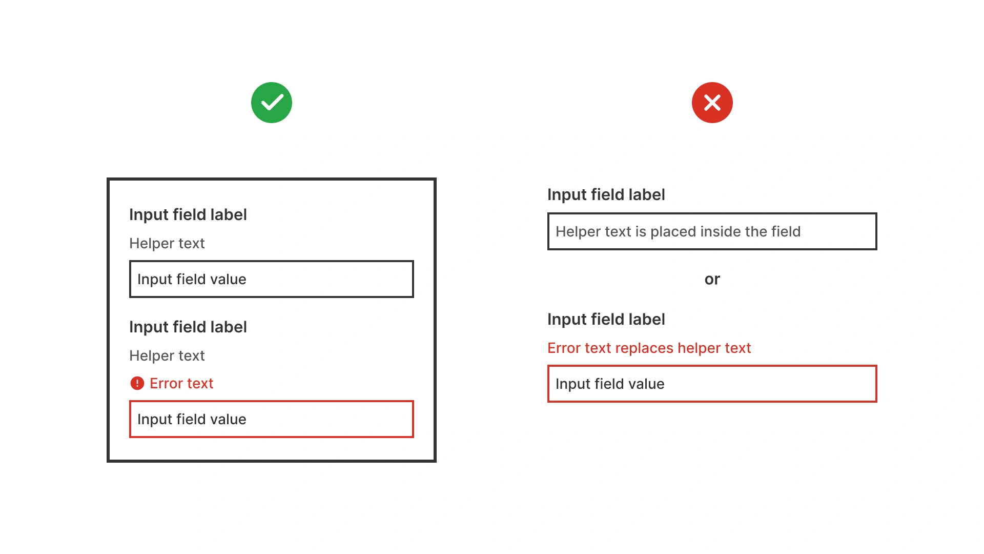
Always use a visible label
Do not rely on placeholder text as the only identifier. Labels must remain visible when a field is focused or filled.

References:
- Form design – Baymard Institute
- Creating accessible forms – WebAIM
- Placeholders in form fields are harmful – Nielsen Norman Group
Use sentence case for labels
Sentence case improves scanning and accessibility, especially for users with dyslexia. Avoid ALL CAPS or Title Case in form labels.
References:
Ensure minimum size and weight
Labels should be at least 14px (0.875rem) and medium weight for clarity. Helper and error text may be smaller (12px / 0.75rem) but must remain readable.
References:
Provide sufficient contrast
Labels, helper text, and error messages must meet WCAG contrast ratios: 4.5:1 for normal text, 3:1 for large/bold text. Do not use light gray text for active labels.
Use tools like WebAIM contrast checker or built-in design system validators to verify compliance.
References:
Use differentiate label, helper, and error text
Each type of text should have a distinct role:
- Labels: clear, always visible.
- Helper text: smaller, neutral color.
- Error text: same size as helper but high contrast and often red.
References:
Align labels consistently
Left-aligned labels above fields are fastest to scan. Inline labels or floating labels should be used carefully and always tested.
References:
Common mistakes
Frequent pitfalls when case styles are misused in digital products.
Using placeholder text instead of labels
When the placeholder disappears on input, users may forget what the field required.
Labels too small or light
Low-contrast gray labels at 12px / 0.75 rem or smaller are unreadable for many users.
Inconsistent styles for error and helper text
If error text looks identical to helper text, users may miss critical issues.
Using all caps labels
ALL CAPS harms readability and accessibility in forms.
Summary
Typography in labels is essential for usable, accessible forms.
- Always use visible labels, never placeholders alone.
- Keep labels at least 14px / 0.875rem, helper and error text at least 12px / 0.75 rem.
- Ensure high contrast and clear differentiation between label, helper, and error text.
- Use sentence case for readability and accessibility.
Good label typography prevents errors, improves form completion, and builds trust.
AI prompts
Ready-to-use AI prompts for design agents. Each scenario is pre-loaded with the UX rules from this guide. Copy, adapt to your context, and generate consistent, well-structured output from the start.
Scenario: Form label typography
Use when designing the visual style of form labels, ensuring they are readable, clearly distinct from input text, and accessible for all users.