Overview
Forms are a primary point of interaction between users and products. But they’re also where errors most often occur. For many users, especially those with cognitive impairments, low vision, or motor difficulties, unclear or inaccessible error handling can make forms unusable.
Accessible forms reduce errors through clear guidance, validation, and recovery options. They not only support compliance with WCAG but also improve confidence, trust, and completion rates for all users.
Best practices
Guidelines for preventing and recovering from errors in forms.
Prevent errors before they happen
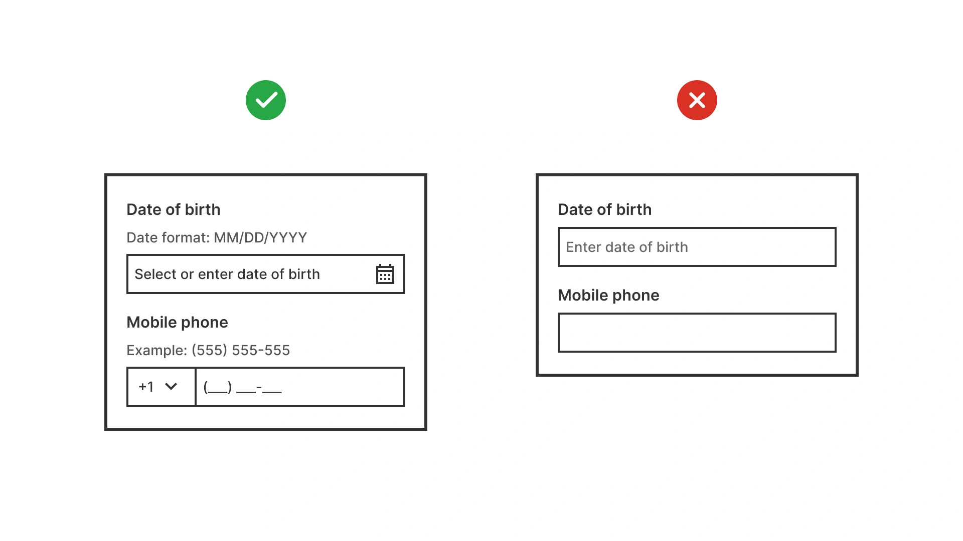
Use inline hints, examples, and constraints (like input masks) to guide users before submission. Prevention reduces frustration and abandonment.
References:
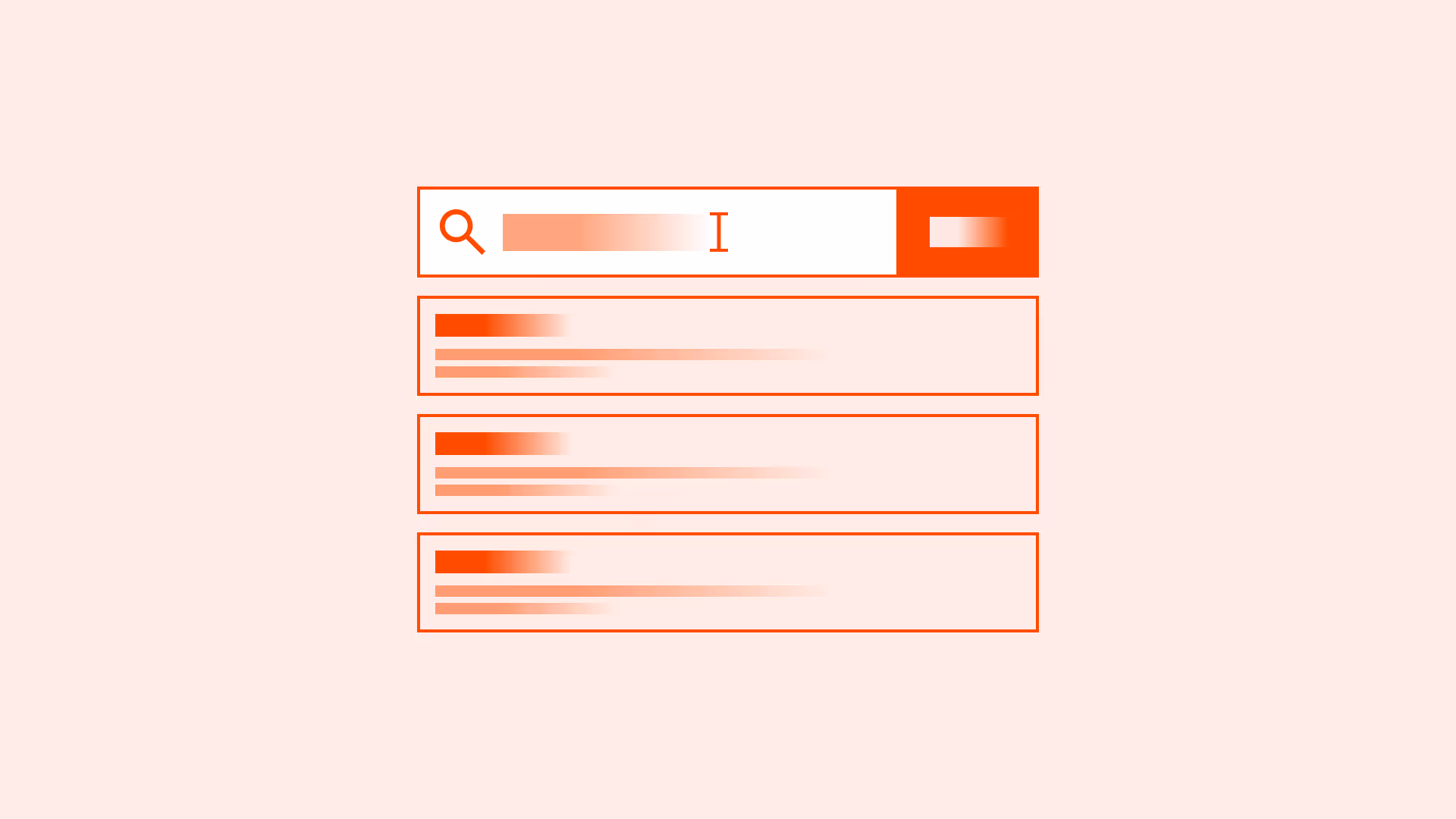
Validate inputs at the right time
Run validation after users complete a field, not while typing every character. Provide immediate but non-intrusive feedback.

References:
- Indicators, validations, and notifications – Nielsen Norman Group
- 10 design guidelines for reporting errors in forms – Nielsen Norman Group
Provide clear and actionable error messages
Tell users exactly what went wrong and how to fix it (“Password must include at least one number”) instead of vague phrases (“Invalid input”).

References:
Keep errors close to the field
Place error text directly below or beside the field so users can fix issues without scanning the whole page.
References:
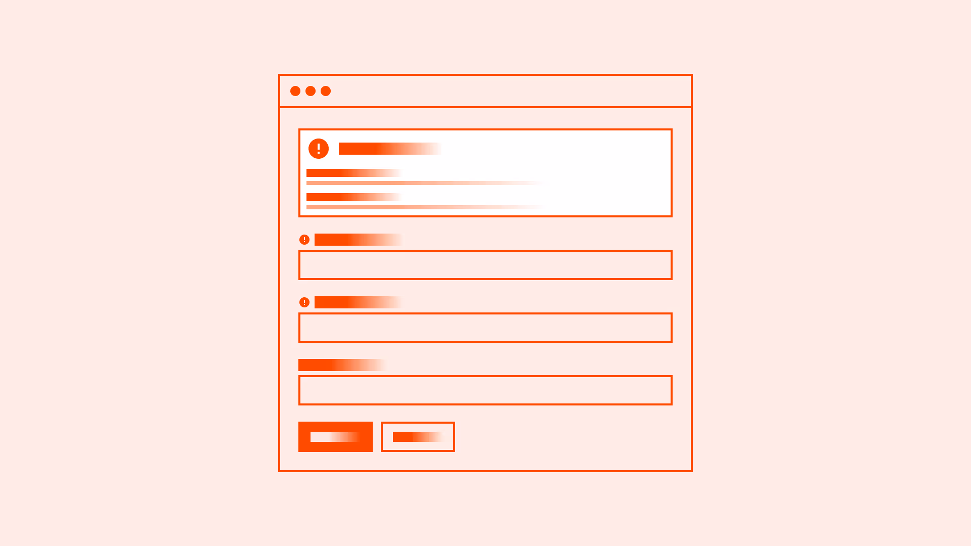
Offer a summary of errors when needed
For long forms, include an error summary at the top with links that jump to each problematic field.
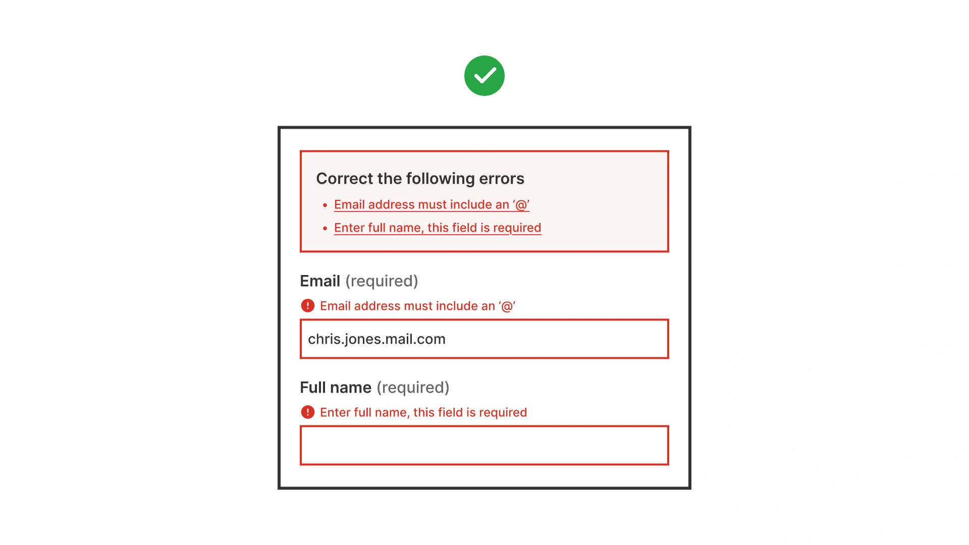
Form with error summary at the top. Red box lists multiple errors: missing ‘@’ in email and required full name. Each field also shows inline error messages
References:
Allow easy recovery from mistakes
Preserve user input when reloading after errors. Never wipe data, re-entering is especially painful for users with cognitive or motor difficulties.
References:
Support accessibility with ARIA attributes
Use aria-invalid="true" on fields with errors and aria-describedby to link inputs with their error messages.
References:
Common mistakes
Frequent mistakes in error prevention and recovery.
Showing vague or technical error codes
Using “Error 503” instead of clear instructions confuses users.
Highlighting errors only with color
Errors must have text or programmatic labels in addition to color.
Clearing all inputs after submission errors
Forces users to re-enter data and increases frustration.
Grouping multiple error messages far from fields
Users must not scan the whole page to understand which field failed.
Triggering validation too early
Overwhelms users mid-typing with unnecessary feedback.
Summary
Key takeaways for accessible error prevention and recovery.
- Prevent errors with inline hints and examples.
- Validate at the right moment, not too early, not too late.
- Use clear, actionable, accessible error messages.
- Place errors near the field, with optional summaries for long forms.
- Always preserve user input and support ARIA roles for accessibility.
Accessible error prevention and recovery transforms frustrating forms into supportive, inclusive experiences.
AI prompts
Ready-to-use AI prompts for design agents. Each scenario is pre-loaded with the UX rules from this guide. Copy, adapt to your context, and generate consistent, well-structured output from the start.
Scenario 1: Preventing errors before they happen
Use when designing forms where users frequently make avoidable mistakes: payment fields, address inputs, date fields, or any field with strict formatting requirements.
Scenario 2: Helping users recover from errors
Use when validation has run and one or more fields have failed: the focus shifts from prevention to guiding the user to fix mistakes as quickly as possible.