Overview
Buttons are one of the most critical elements in any interface. They are scanned more often than they are read, so clarity and predictability are essential. Poor button typography leads to hesitation, misclicks, and even task abandonment.
Typography in buttons should communicate action in the simplest way possible. It should balance clarity, accessibility, and brand consistency.
Best practices
Principles for setting button text consistently and accessibly.
Use sentence case for button and label text
Sentence case is faster to scan and more accessible, especially for users with dyslexia. Avoid Title Case and ALL CAPS except in rare emphasis contexts.
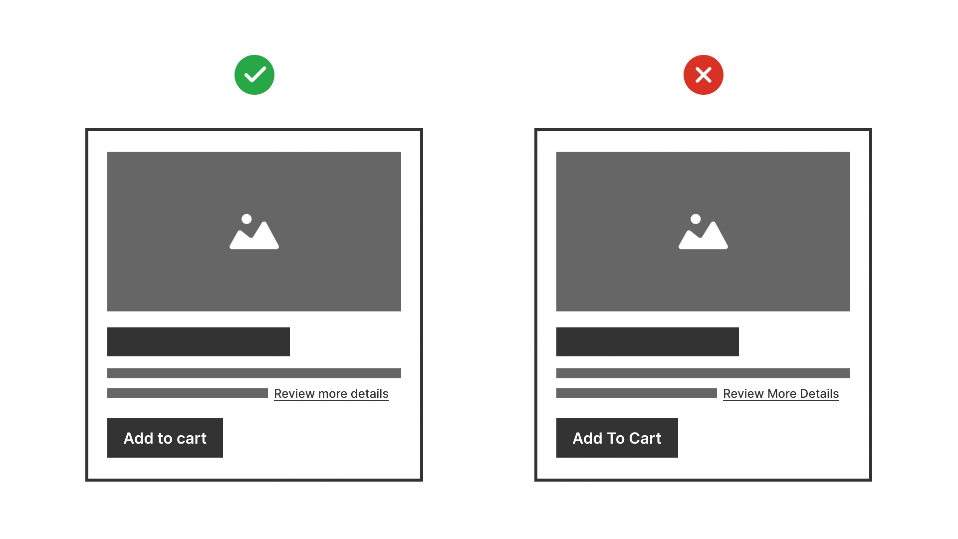
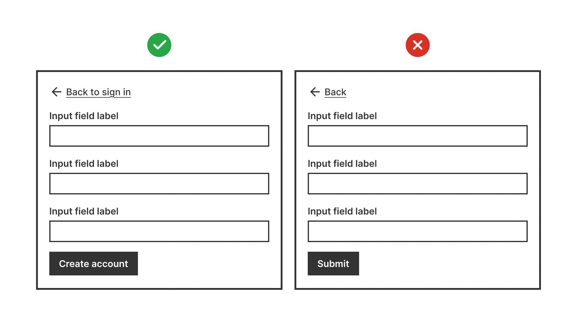
Good example shows buttons in sentence case like ‘Add to cart’. Bad example shows title case ‘Add To Cart’, reducing readability
References:
Use consistent typography across button types
Primary, secondary, and tertiary buttons should differ visually in color and emphasis, not in typography. Using different sizes or case styles creates inconsistency.
References:
Write clear, action-oriented button labels
Buttons are the primary way users take action, so their labels must be concise, purposeful, and aligned with the user’s intent.
- Focus on the user’s goal. Write from the perspective of what the user wants to do (“Place order”), not what the system does (“Process order”).
- Lead with strong verbs that signal the next step (for example: “Save changes”, “Add to cart”, “Upload photo”).
- {Verb} [the] {noun}. Avoid generic terms like “Continue” or “OK”. Instead, clarify the outcome: “Continue to payment”, “Confirm booking”.
- Strive for 1–3 words. Prioritize clarity over brevity, but cut unnecessary words.
- Match the surrounding context. Button text should align with headings and instructions. For example, if the header says “Create account”, the button should say “Create account”, not “Submit”.
References:
Ensure minimum size and weight for readability
Button text should be at least 14px / 0.875rem and use medium or semi-bold weight. This ensures visibility without overpowering the layout. Never go below 12px / 0.75rem.
References:
Provide sufficient contrast in all states
Buttons must meet WCAG contrast ratios: 4.5:1 for normal text, 3:1 for large/bold text. Test hover, focus, pressed, and disabled states to ensure readability.
Use tools like WebAIM contrast checker or built-in design system validators to verify compliance.
References:
Common mistakes
Frequent pitfalls when case styles are misused in digital products.
Using all caps for all buttons
ALL CAPS reduces readability and accessibility, especially for longer button text.
Inconsistent typography across button styles
Primary and secondary buttons should look different by color or style, not by using different case or font.
Low-contrast button text
Gray-on-color or disabled-looking text fails WCAG contrast requirements and makes CTAs invisible.
Summary
Typography in buttons is small in size but huge in impact.
- Use sentence case for clarity and accessibility.
- Keep text short, action-oriented, and at least 14px / 0.875rem.
- Maintain consistent typography across all button types.
- Always test contrast in every state.
Predictable, accessible button text builds trust and helps users complete tasks confidently.
AI prompts
Ready-to-use AI prompts for design agents. Each scenario is pre-loaded with the UX rules from this guide. Copy, adapt to your context, and generate consistent, well-structured output from the start.
Scenario: Button text guidelines
Use when designing button labels for a product or design system, ensuring labels are readable, action-oriented, and consistent across all button types.