Overview
Typography hierarchy is the foundation of readable and scannable digital content. It’s not just about making text look good, it’s about establishing a logical visual order that mirrors the structure of the content.
Correct use of hierarchy:
- Helps users understand the importance of different pieces of information
- Makes scanning faster and reduces cognitive load
- Improves accessibility by mapping visual hierarchy to semantic HTML
A well-designed hierarchy uses consistent scaling, spacing, and semantic HTML elements <h1> – <h6>, <p>, <label> so that both visual users and assistive technologies interpret the structure correctly.
Best practices
These best practices combine visual hierarchy and accessibility requirements into actionable steps.
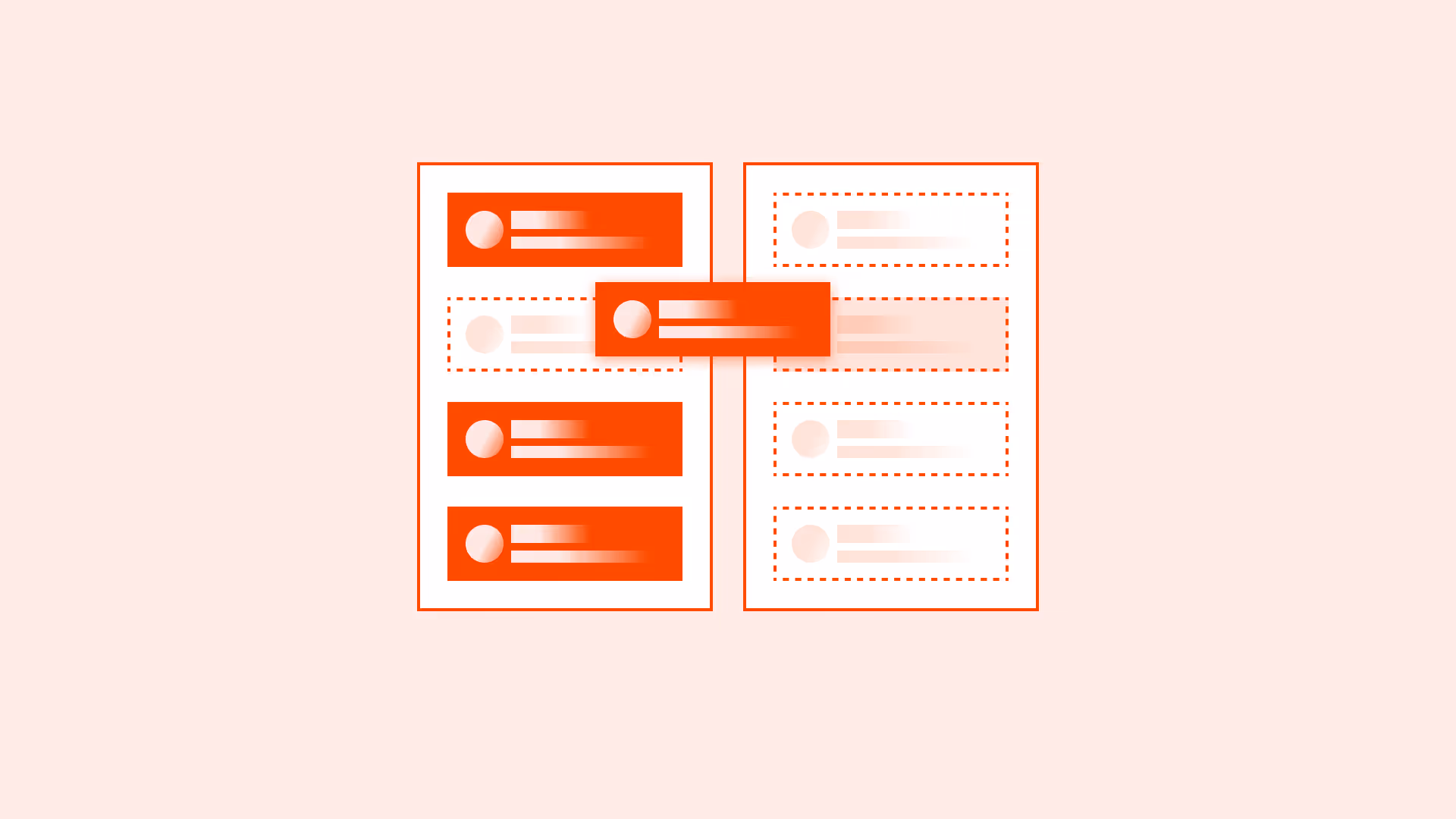
Use only one <h1> per page
Each page should have exactly one <h1> that represents the primary topic. Multiple <h1> elements dilute meaning, confuse assistive technologies, and harm SEO clarity. All subsequent headings <h2> – <h6> should follow a logical order.

References:
Follow a consistent scale
Use a typographic scale to define relationships between headings, subheadings, and body text. This creates visual rhythm, improves scanability, and reduces cognitive load.
Common ratios:
- 1.125 – Major second
- 1.250 – Major third
- 1.333 – Perfect fourth
- 1.618 – Golden ration
References:
- WCAG 1.4.8: Visual presentation
- Visual hierarchy in accessible design – W3C WAI
- Modular scale – Tim Brown
- The elements of typographic style – Robert Bringhurst
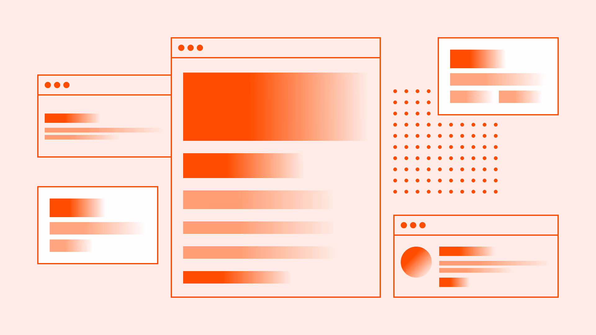
Responsive scaling across devices
Typography should scale smoothly between desktop, tablet, and mobile. Maintain the same scale ratio but adjust absolute sizes to fit the screen. Increase line height on smaller viewports for readability.
Device guidelines:
- Desktop: Use the full modular scale to maximize visual hierarchy
- Tablet: Reduce heading sizes by 10–15% while preserving the scale
- Mobile: Reduce heading sizes by 20–25% for better fit
References:
- WCAG 1.4.4: Resize text
- Linearly scale font-size with CSS clamp() based on the viewport - CSS Tricks
- Refactoring UI – Adam Wathan, Steve Schoger
Match semantic and visual hierarchy
Ensure that the visual prominence of a heading matches its semantic HTML tag. A <h3> should never appear larger than a <h2>. Misalignment disrupts scanning and harms accessibility.

References:
Minimum text sizes for accessibility
Ensure that all text meets minimum size requirements for legibility across devices. For body text, use at least 16px / 1rem on mobile and tablet, as smaller sizes can be difficult to read for many users. For secondary text (captions, footnotes), avoid going below 12px / 0.75rem on high-density screens. These sizes help users with low vision, prevent eye strain, and comply with accessibility guidelines. Always test text readability on real devices and under various lighting conditions.
References:
- WCAG 1.4.4: Resize text
- How to pick the perfect font size – a11y
- Typography – Apple Human Interface Guidelines
- Typography – Google Material Design
Color contrast ratios for accessibility
Ensure that text and interactive elements meet minimum contrast ratios defined by WCAG to maintain readability for all users, including those with low vision or color vision deficiencies.
- Normal text (< 24px / 1.5rem regular or < 18px / 1.125rem bold): Minimum 4.5:1 contrast ratio against its background
- Large text (≥ 24px / 1.5rem or ≥ 18px / 1.125rem bold): Minimum 3:1 contrast ratio
Use tools like WebAIM contrast checker or built-in design system validators to verify compliance. Always test contrast with real UI states (hover, active, disabled).

References:
Design for scanning
Structure typography so users can quickly scan and understand page content without reading every word. Most users scan first and read selectively, especially on the web.
- Use clear headings and subheadings to break content into logical sections
- Highlight important terms with bold or color emphasis, but avoid overuse
- Maintain consistent typographic hierarchy so scanning patterns remain predictable
Designing for scanning improves comprehension speed, reduces cognitive load, and aligns with natural eye-tracking behaviors.
References:
Common mistakes
Even well-intentioned typography can fail if the basics are overlooked. From mismatched heading levels to poor contrast, these missteps can weaken both usability and accessibility. Below are the most frequent errors to watch out for.
Multiple <h1> elements to “boost SEO”
Confuses screen readers, dilutes page focus, and harms search clarity.
Skipping heading levels for quick styling
Breaks logical order, harming navigation for assistive tech.
Styling headings purely for aesthetics
Misaligning visual size with semantic level disrupts scanning.
Arbitrary font sizing without a scale
Creates inconsistency and visual noise.
Low-contrast “modern” text
Fails WCAG, making text harder to read.
Shrinking main body text below 16px / 1rem on mobile
Reduces readability and accessibility.
Ignoring mobile typography adjustments
Oversized headings on small screens hurt usability.
Summary
A strong typography hierarchy isn’t decoration, it’s a system for clarity, accessibility, and trust. Use one <h1> per page, align visual and semantic order, maintain a consistent scale, and meet WCAG standards.
Accessibility is baked into every decision, size, contrast, scaling, not added after the fact.When hierarchy is intentional, it makes every word easier to find, read, and remember.
AI prompts
Ready-to-use AI prompts for design agents. Each scenario is pre-loaded with the UX rules from this guide. Copy, adapt to your context, and generate consistent, well-structured output from the start.
Scenario: Page typography system
Use when designing or auditing the heading and type hierarchy for any page or product, ensuring visual weight matches semantic structure and guides users through content.