Overview
Tabs are a familiar navigation pattern for grouping related content into manageable sections. They:
- Keep users in context without page reloads.
- Help organize content at the same hierarchy level.
- Provide fast switching between categories, views, or settings.
But tabs can harm usability if labels are unclear, states are not accessible, or too many tabs clutter the interface.
Best practices
Guidelines for designing and implementing tabs.
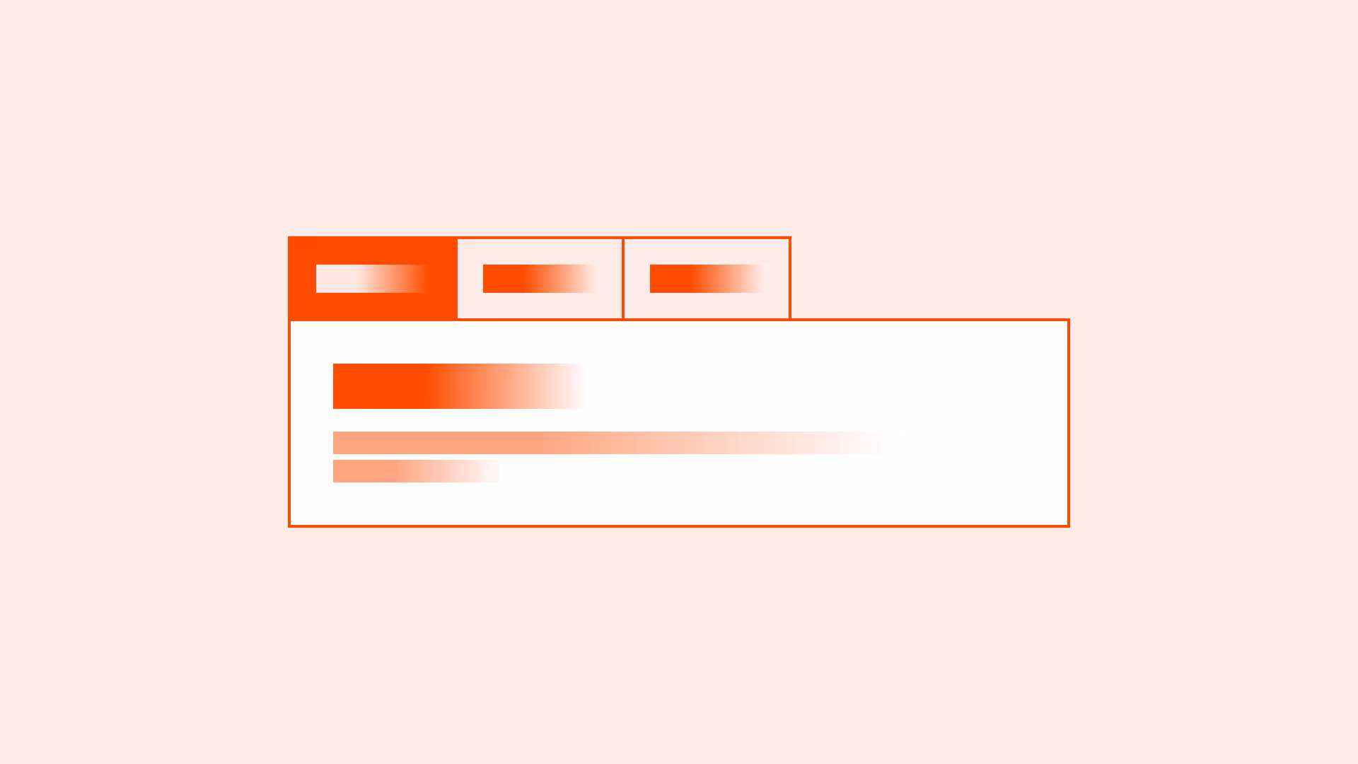
Use tabs for content at the same hierarchy level
Tabs are ideal when sections are parallel in importance (for example: “Overview,” “Details,” “Reviews”). Do not use them for sequential flows.

References:
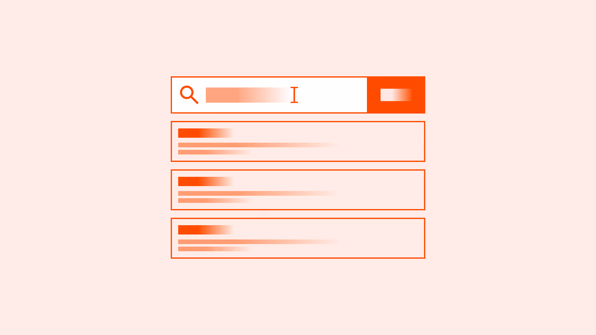
Provide clear and concise labels
Labels should describe the tab’s content in a few words. Avoid vague terms like “Tab 1” or “More.”
References:
- WCAG 2.4.6: Headings and labels
- Content design – Sarah Richards
Make active and inactive states visually distinct
The active tab must be clearly highlighted with strong contrast and visual indicators.
References:
- WCAG 1.4.3: Contrast minimum
- Contrast guidelines – WebAIM
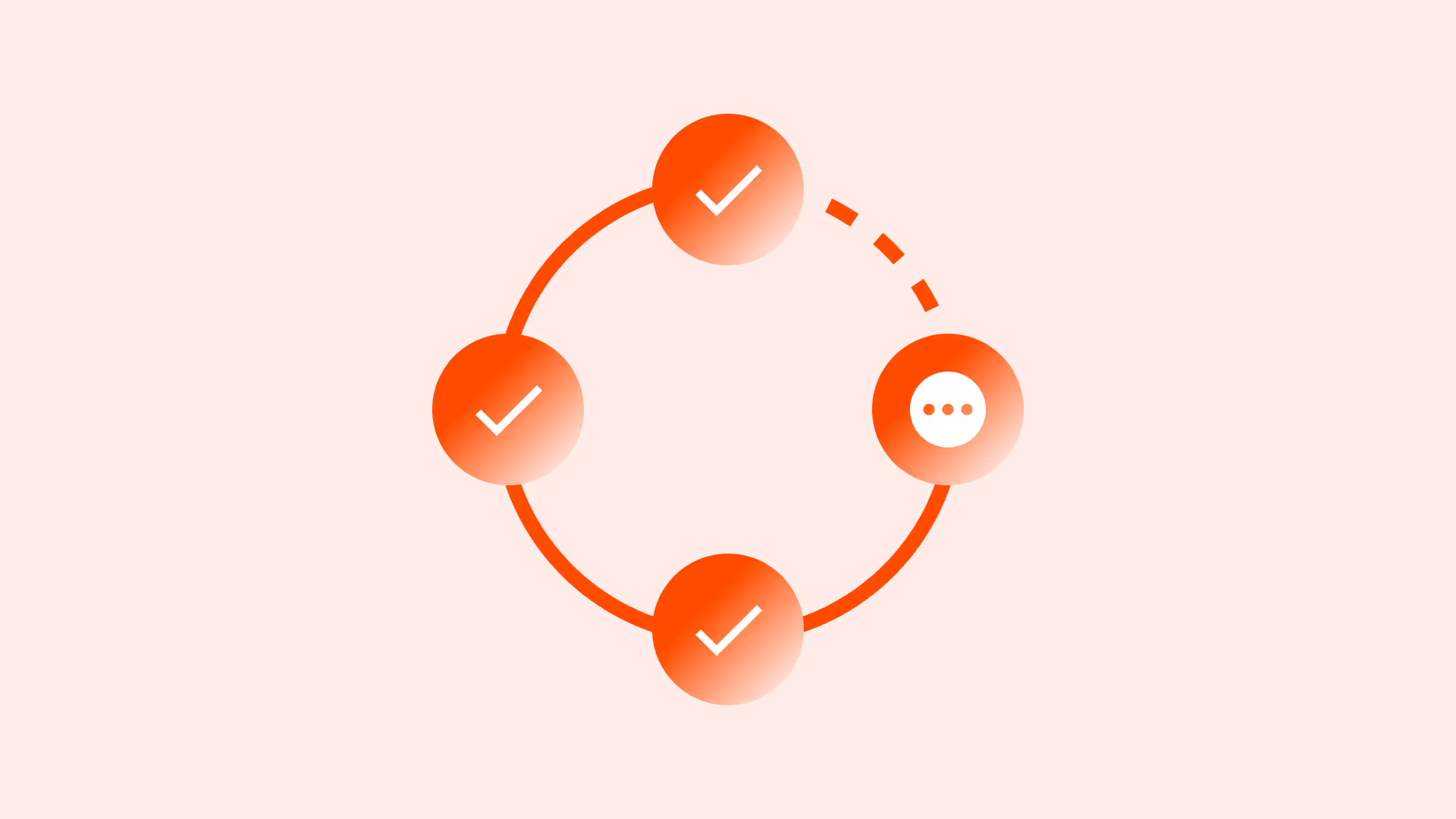
Ensure accessibility with ARIA roles and keyboard support
Use role="tablist", role="tab", and aria-selected. Tabs must be navigable by keyboard (arrow keys, enter/space).
References:
Keep the number of tabs manageable
Limit tabs to 5–7. Too many tabs reduce scanability and overwhelm users. If more content categories are needed, use secondary navigation (for example: a dropdown or a vertical menu).
On mobile, fewer tabs (3–5) are preferable due to limited space.
References:
Common mistakes
Frequent mistakes when using tabs.
Using tabs for sequential tasks
Tabs are not step-by-step navigation. This confuses users who expect completion order.
Unclear or truncated tab labels
Users must understand content before clicking. Truncation reduces clarity.
Not highlighting the active tab
Users lose orientation if the active state isn’t visually distinct.
Overloading with too many tabs
Forces horizontal scrolling or dropdowns that reduce discoverability.
Summary
Key takeaways for tabs.
- Tabs are best for organizing content at the same hierarchy level.
- Always provide clear, concise, and visible labels.
- Make active states distinct and support accessibility with ARIA and keyboard navigation.
- Keep tab counts manageable, with logical ordering and overflow strategies.
- Avoid using tabs for sequential tasks or hiding key content behind truncation.
Done right, tabs simplify navigation and keep users in context. Done poorly, they confuse, overwhelm, and exclude.
AI prompts
Ready-to-use AI prompts for design agents. Each scenario is pre-loaded with the UX rules from this guide. Copy, adapt to your context, and generate consistent, well-structured output from the start.
Scenario: Content tabs
Use when organizing parallel content sections that users switch between without leaving the page: product details, settings categories, or different views of the same data.