Overview
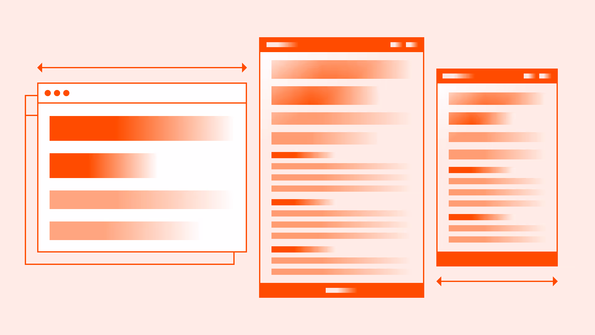
Typography doesn’t live in a fixed frame. What feels balanced on a wide desktop can overwhelm or shrink on mobile. Responsive text scaling makes sure the hierarchy holds across every screen size, headings stay dominant, body text stays legible, and rhythm remains consistent.
Good scaling is not about shrinking everything evenly, it’s about preserving proportions defined by your typographic scale, while optimizing for legibility in different contexts.
Best practices
Key techniques to make typography scale smoothly across devices while staying accessible.
Maintain a consistent scale
Preserve the SubUX modular scale across breakpoints. For headings we use 1.333, and for body text 1.25. Sizes adjust, but proportions remain stable.
References:
Use relative units
Define text in rem or em, not fixed px. This ensures scaling works across devices and user preferences. Pair with CSS clamp() for fluid typography.
References:
Responsive scaling across devices
On tablets, reduce headings by ~10–15%; on mobile by ~20–25%. Body text should never go below 16px / 1rem to comply with WCAG 1.4.4.

References:
Increase line height on smaller screens
Tighter layouts require more breathing room. For mobile, raise line height from 1.4 → 1.5. This improves scanability in narrow viewports.
References:
- WCAG 1.4.8: Visual presentation
- Flexible web design – Zoe Mickley Gillenwater
Test at real breakpoints
Check typography at 320px, 375px, 768px, and 1024px. What looks balanced in Figma might feel oversized on a real device.
References:
- Typography – Apple Human Interface Guidelines
- Simple solutions to responsive typography – Kevin Powell
- Responsive typography – Jason Pamental
Common mistakes
Frequent pitfalls that break readability and hierarchy when scaling text.
Shrinking all text equally
Scaling everything down by the same percentage often makes body text too small. Always keep <p> ≥ 16px / 1rem.
Oversized headings on mobile
Leaving desktop <h1> at 64px / 4rem on a 375px screen consumes the viewport. Resize proportionally.

Ignoring line height adjustments
Too tight on mobile makes text blocks unreadable. Always loosen spacing in narrow layouts.
Using px units only
Fixed pixels break user zoom preferences and accessibility resizing.
Testing in design tools only
Testing only in static mockups misses real-world device rendering and font rendering differences.
Summary
Responsive typography scaling is not about shrinking text, it’s about preserving hierarchy, rhythm, and accessibility across every device.
A consistent system ensures content remains readable, scannable, and accessible everywhere.