Overview
Radio buttons are often confused with checkboxes, but they serve a different purpose. A checkbox allows multiple selections, while radio buttons enforce exclusivity: the user can choose only one option from a group.
Used correctly, radio buttons reduce errors and make decisions clear. Misused, they frustrate users and create uncertainty.
Best practices
Guidelines for designing and implementing radio buttons.
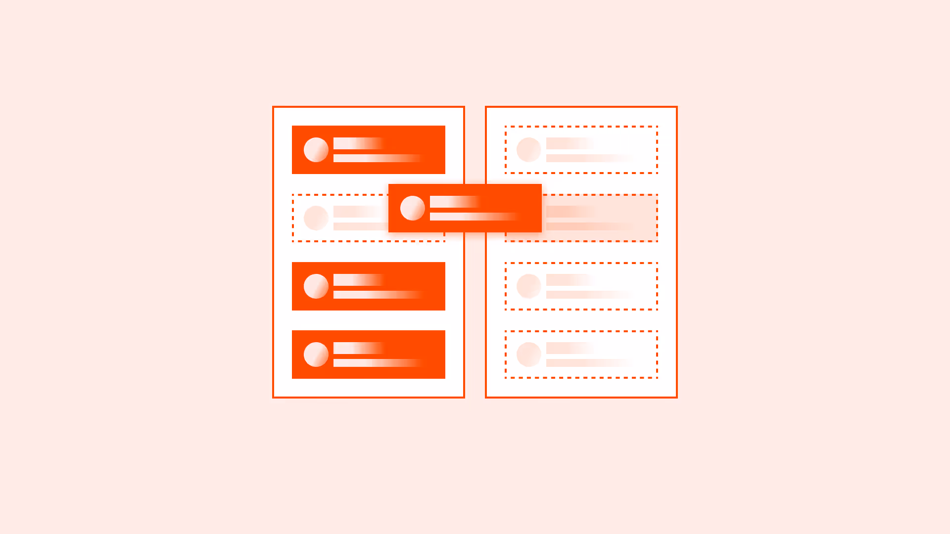
Use radio buttons for mutually exclusive options
Ideal when only one selection is valid (for example: choosing a shipping method). Do not use checkboxes in this case.

References:
Provide clear group labels
A group of radio buttons must have a descriptive label (using <fieldset> and <legend> or ARIA equivalents). Without it, users may not know the question being asked.
References:
Set a sensible default when possible
Preselect the most common or safe option to reduce cognitive load, but always allow users to change it.
References:
Arrange options vertically for scanability
Vertical layout improves readability, especially for long labels or multiple options. Use horizontal layout only for short, related items (for example: Yes/No).

References:
Ensure accessibility states
Radio buttons must be keyboard navigable, and screen readers should announce the group, option, and selection state.
References:
Common mistakes
Frequent mistakes when using radio buttons.
Using radio buttons when multiple selections are possible
This misleads users and forces them to choose only one, even when more may be valid.
Not grouping radio buttons properly
Without grouping, screen readers cannot announce the context of the choices.
Providing too many options without structure
Long, ungrouped lists overwhelm users and make scanning difficult.
Placing options horizontally with long labels
Creates readability problems and forces unnecessary eye movement.
Summary
Key takeaways for radio buttons.
- Use radio buttons only for mutually exclusive choices.
- Always provide a clear group label with <fieldset> and <legend>.
- Preselect a default if it reduces effort, but keep it user-changeable.
- Arrange options vertically unless labels are very short.
- Support accessibility with proper grouping and ARIA states.
Radio buttons make exclusive choices clear and efficient. Misused, they confuse, mislead, and create accessibility barriers.
AI prompts
Ready-to-use AI prompts for design agents. Each scenario is pre-loaded with the UX rules from this guide. Copy, adapt to your context, and generate consistent, well-structured output from the start.
Scenario: Plan or option selection
Use when the user must choose exactly one option from a set: pricing plans, delivery methods, account types, or payment options.