Overview
Links and buttons are two of the most common interactive elements in interfaces. But they serve different purposes. Misusing them not only confuses users but also harms accessibility and can even mislead assistive technologies.
Links are for navigation. Buttons are for actions. When the distinction is clear, users move confidently through an interface. When it’s blurred, confusion and frustration grow.
Best practices
Guidelines for choosing between links and buttons.
Use links for navigation
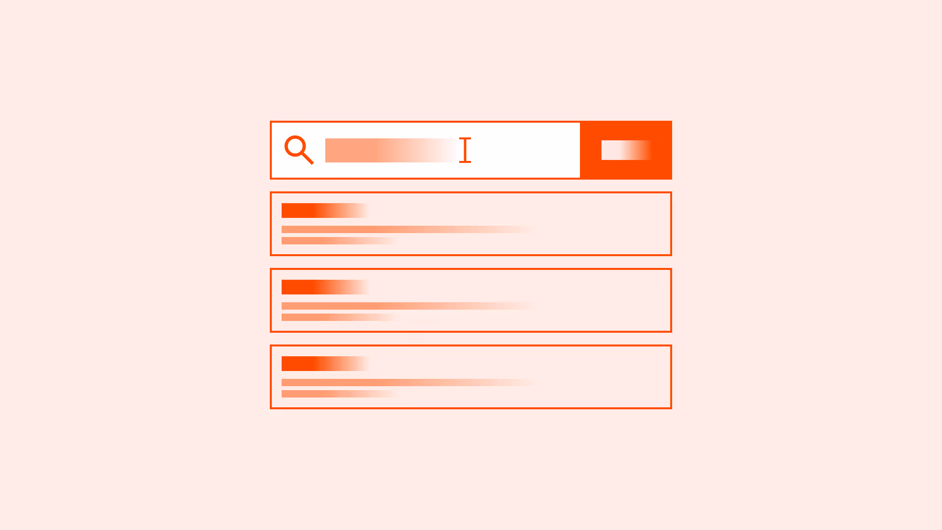
Links (<a>) must be used exclusively for navigation. A link should take the user to another location, either a different page, a section of the same page, or an external resource.
Do not use links for triggering actions (for example: submitting a form, opening a modal, toggling content). For interactive behaviors that do not change the URL, use a <button> instead.
Links may be styled to look like buttons for visual consistency, but they remain semantically links and should preserve their navigation behavior.

References:
Use buttons for actions
Buttons trigger changes in the current page or system: submit a form, open a modal, toggle a setting. They signal “do something.”

References:
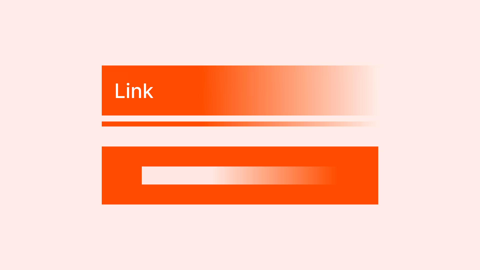
Style links as buttons when navigation must look like an action
If a navigation element must visually look like a button (for example: “Checkout”), use <a href="…" > with button styling. This preserves correct semantics and accessibility.
References:
Ensure accessibility with proper markup
Use <a> with href for links and <button> for actions. Don’t misuse <div> or <span> with click handlers. Assistive technologies rely on correct semantics.
Provide clear focus and hover states
Both links and buttons must have visible focus and hover states for clarity and accessibility.

References:
Common mistakes
Frequent mistakes when using links and buttons.
Using buttons for navigation to another page
Buttons are for actions in the current context, not for navigation. This breaks semantics and harms accessibility.
Using links to submit forms or trigger modals
Misleads users and creates accessibility issues.
Mixing visual styles
A link styled as a button, or a button styled as plain text, erodes trust.
Not providing focus styles
Makes it harder for keyboard users to interact reliably.
Underlined text in buttons
Users expect underlined text to be a link. In buttons this breaks the mental model and causes confusion.
Summary
Key takeaways for links vs buttons.
- Links navigate, buttons act — keep the distinction clear.
- Use correct HTML semantics (<a> vs <button>) for accessibility and consistency.
- If navigation must look like a button, use a styled link, not a button.
- Provide visible focus and hover states to support all users.
- Avoid underlined text in buttons to prevent confusion.
Getting links and buttons right might seem like a small detail, but it’s fundamental to usable, accessible, and trustworthy interfaces.
AI prompts
Ready-to-use AI prompts for design agents. Each scenario is pre-loaded with the UX rules from this guide. Copy, adapt to your context, and generate consistent, well-structured output from the start.
Scenario: Auditing interactive elements
Use when auditing an interface for semantic misuse of <a> and <button>, incorrect element choice breaks keyboard behavior and accessibility.