Overview
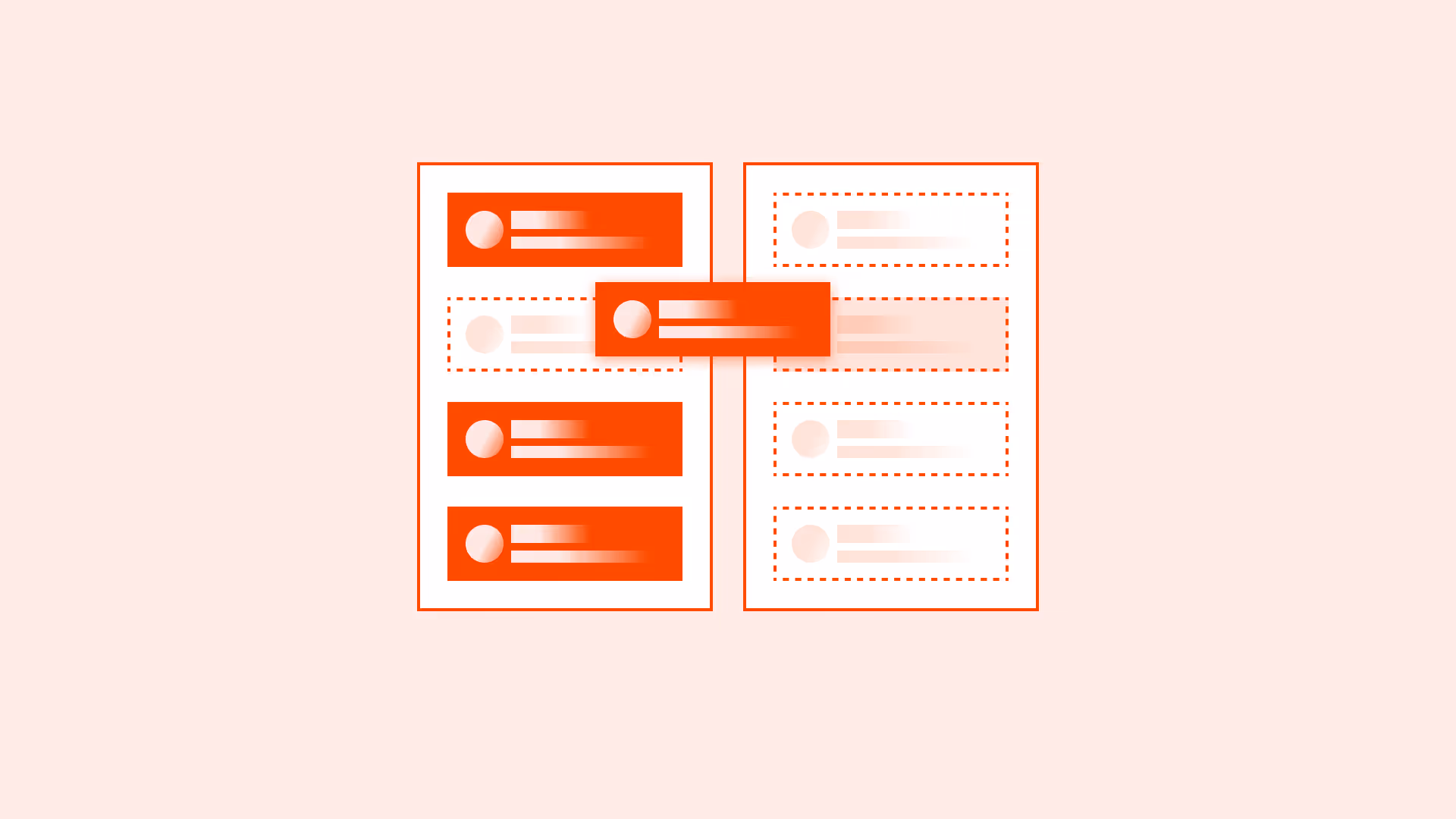
Labels are one of the most overlooked details in form design, yet they carry critical weight. A label’s position determines how quickly users can scan a form, how accurately they can complete it, and how accessible it is for screen readers.
Badly placed labels slow users down, increase error rates, and can even make a form unusable for people with disabilities. Thoughtful label placement, on the other hand, makes forms faster, clearer, and more inclusive.
Best practices
Guidelines for effective label placement in forms.
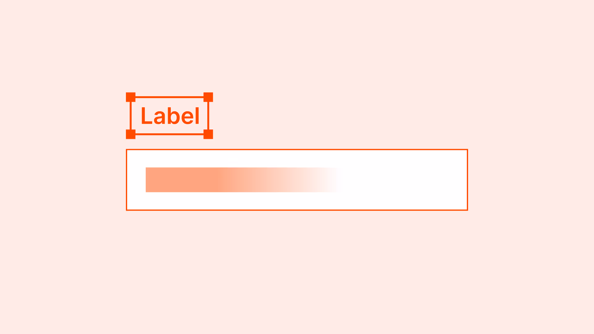
Place labels above the input field
Top-aligned labels are the most effective for readability and scanning, especially on mobile devices. They reduce eye movement and work well with responsive layouts.

References:
Avoid placing labels inside the field (as placeholders)
Placeholder text disappears when users start typing, which causes confusion, increases memory load, and creates accessibility issues. Placeholders should only be used for hints, not as labels.
References:
Left-aligned labels work only for very short forms
For compact desktop forms with very few fields, left-aligned labels can be acceptable. However, they increase scanning distance and slow completion in longer forms.

References:
Always link labels programmatically to inputs
Labels must be associated with their input using the for attribute or by wrapping the input. This ensures screen readers announce the label correctly.
Example: <label for="email">Email address</label><input id="email" …>
References:
Use concise and descriptive labels
Labels should clearly describe the expected input (“Email address” instead of just “Email”). Avoid jargon or vague wording.
References:
Maintain proper spacing between labels and fields
Labels must be visually close to their inputs. If spacing is too large, users may lose the connection. If spacing is too tight, readability suffers.
Common mistakes
Frequent mistakes in label placement.
Using placeholder text instead of labels
Confuses users, increases error rates, and fails accessibility.

Placing labels too far from fields
Breaks the visual association, especially in dense layouts.
Overly long or vague labels
Creates uncertainty about what information is expected.
Mixing label placement styles within one form
Inconsistency makes the form harder to scan and less predictable.
Summary
Key takeaways for label placement.
- Top-aligned labels are the most effective and responsive choice.
- Placeholders should never replace labels.
- Always programmatically link labels to inputs.
- Concise, descriptive labels improve clarity and accessibility.
- Consistency in placement helps users scan and complete forms faster.
Small adjustments in label placement can significantly improve both usability and accessibility of forms.
AI prompts
Ready-to-use AI prompts for design agents. Each scenario is pre-loaded with the UX rules from this guide. Copy, adapt to your context, and generate consistent, well-structured output from the start.
Scenario: Standard data entry form
Use when designing label placement for a form with multiple fields. The position of labels relative to inputs affects scan speed, completion rates, and mobile usability.