Overview
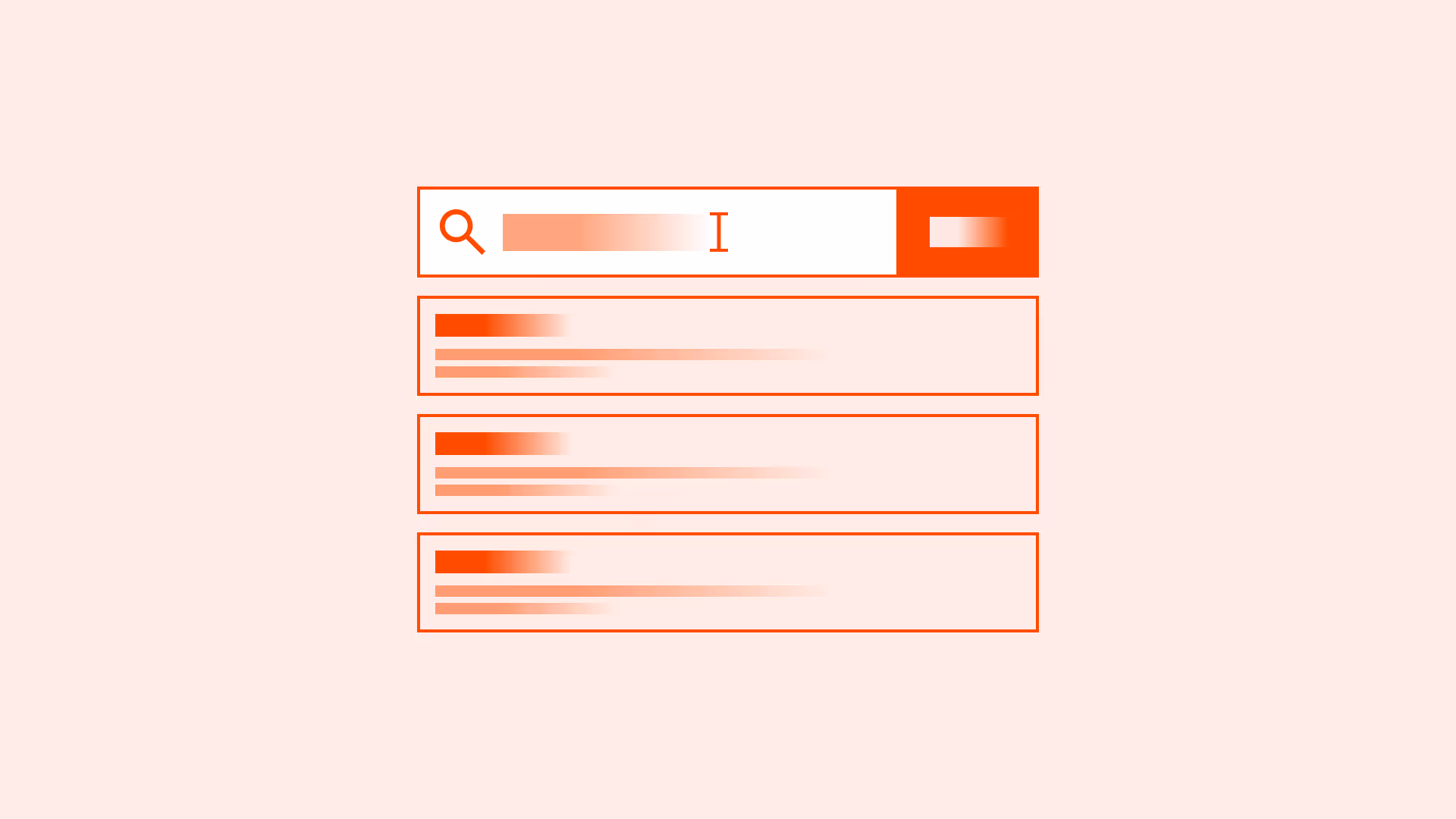
Every input field sets the stage for how users provide information. Selecting the correct type is not just about technical accuracy, it directly shapes usability, mobile experience, and accessibility.
The wrong input type can lead to frustration, errors, or even abandonment. For example, using a generic text field for phone numbers forces users to switch keyboards, while a password field without visible toggle makes authentication harder. Correct use of input types reduces friction, aligns expectations, and creates more user-friendly forms.
Best practices
Guidelines for choosing and applying input types effectively.
Use semantic input types whenever possible
Always use the most appropriate HTML input type (for example: email, tel, url, number, date). This helps browsers show optimized keyboards, improves validation, and supports assistive technologies.
Example: <input type="email" aria-label="Email address">
References:
Default to text fields only when no better type exists
If no semantic type fits (for example: “Username”), use type="text". Avoid misusing text fields where structured input is expected.
References:
- Designing UX: Forms – Jessica Enders
Support mobile-friendly inputs
Correct input types trigger the right virtual keyboard. For example, type="tel" opens a numeric keypad, type="email" shows @ and .com keys. This speeds up entry and reduces mistakes.
References:
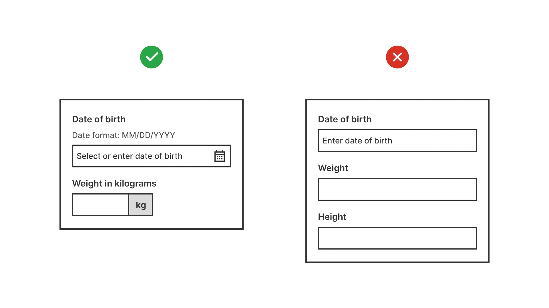
Provide clear labels and instructions
Labels must always describe what is expected, regardless of input type. Avoid relying on placeholder text. If formatting matters (for example: date format), provide inline guidance.
References:
Use appropriate masking and formatting
For structured inputs (for example: phone number, credit card), apply formatting or masks that help users, but do not restrict them unnaturally. Always allow copy-paste.
References:
- Forms that work – Caroline Jarrett & Gerry Gaffney
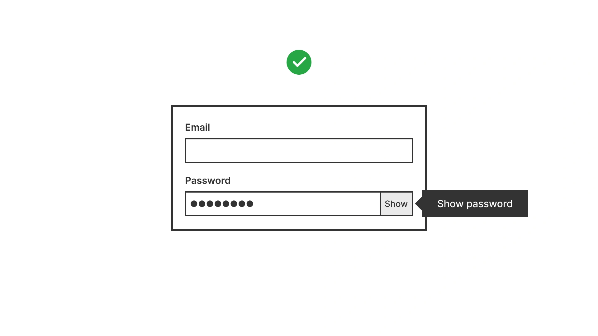
Offer visibility toggles for password fields
Let users view or hide their password as they type. This reduces errors and frustration, especially on mobile.
References:
Common mistakes
Frequent mistakes in input type selection.
Using text fields for everything
Forces unnecessary effort, prevents mobile optimizations, and weakens validation.
Omitting labels because “the type explains itself”
Even with type="email", a field still needs a descriptive label for clarity and accessibility.
Forcing strict input masks
Rejecting valid formats (for example: phone numbers with country codes) frustrates users and blocks submissions.
Hiding password input without a toggle
Increases errors, especially on mobile, where typos are common.
Summary
Key takeaways for input field types.
- Always use semantic input types to improve accessibility and mobile experience.
- Reserve text fields only for inputs without a better semantic option.
- Labels and instructions remain essential, regardless of type.
- Support input formatting, but keep it flexible.
- Small details, like password visibility toggles, make forms faster and less frustrating.
The right input types make forms easier to complete, reduce errors, and show users that their time is valued.
AI prompts
Ready-to-use AI prompts for design agents. Each scenario is pre-loaded with the UX rules from this guide. Copy, adapt to your context, and generate consistent, well-structured output from the start.
Scenario: Choosing the right input type
Use when auditing or designing form fields to ensure the correct HTML input type is applied: improving mobile keyboard experience, browser validation, and autofill.