Overview
Modals and dialogs are powerful UI patterns for alerts, confirmations, or extra input. But when built poorly, they block navigation, trap users, or become invisible to assistive technologies.
An accessible modal should:
- Announce itself clearly.
- Trap focus inside while open.
- Be dismissible by multiple methods.
- Restore focus when closed.
Done right, modals and dialogs provide clarity and control. Done wrong, they exclude keyboard and screen reader users entirely.
Best practices
Guidelines for designing accessible modals and dialogs.
Announce modal role and label
Use role="dialog" or role="alertdialog" with aria-labelledby and aria-describedby so screen readers announce purpose and context.
References:
Trap focus inside the modal
While open, focus must cycle only among modal elements. Background content should be inert and not focusable.
References:
Return focus on close
When the modal closes, programmatically return focus to the element that opened it to preserve context.
References:
Provide multiple dismissal methods
Support Escape key, a visible close button, and (when appropriate) clicking the overlay. Ensure the close button is labeled for screen readers.

References:
Prevent background scrolling and announce changes
Disable page scroll behind the modal to maintain context. Announce important dynamic updates with aria-live if needed.
References:
Support responsive and mobile use
Modals must reflow on small screens without horizontal scrolling and keep controls reachable.
References:
Avoid nesting modals
Stacked dialogs complicate focus management and overwhelm users. Prefer progressive disclosure or inline expansion.
References:
Common mistakes
Frequent mistakes with modals and dialogs.
Not trapping focus, allowing background interaction
Users can tab into the page underneath, losing context and creating confusion.
No Escape support or missing close button
Without predictable dismissal, keyboard and assistive technology users may be trapped.
Forgetting to restore focus to the trigger
Closing the modal should return focus to the opener, not to the page top.
Poor or missing labeling
Screen readers announce only “dialog” with no title or description, giving no context.
Overuse of modals for non-critical content
Content that can be inline or a dedicated page should not interrupt users with a blocking dialog.
Summary
Key takeaways for accessible modals & dialogs.
- Use correct ARIA roles and meaningful labels.
- Trap focus while open and restore it on close.
- Provide multiple, predictable ways to dismiss.
- Prevent background scrolling, announce important updates, and ensure responsive behavior.
- Avoid stacking modals; prefer progressive disclosure.
Accessible modals provide clarity without blocking interaction. Poor ones create barriers and confusion.
AI prompts
Ready-to-use AI prompts for design agents. Each scenario is pre-loaded with the UX rules from this guide. Copy, adapt to your context, and generate consistent, well-structured output from the start.
Scenario 1: Confirmation dialog
Use when the user has triggered a destructive or irreversible action and must confirm intent before it executes.
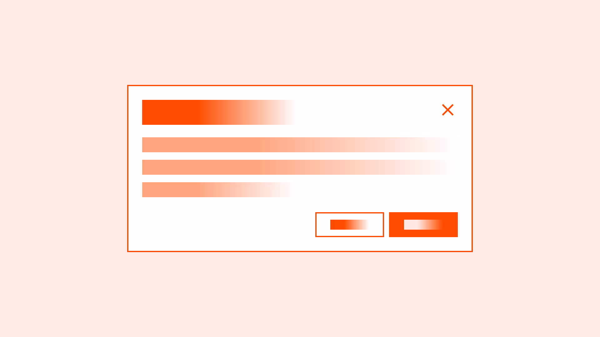
Scenario 2: Form inside a modal
Use when a short form lives inside a modal: adding an item, editing a record, or inviting a user, where the user fills fields and submits without leaving the page.