Overview
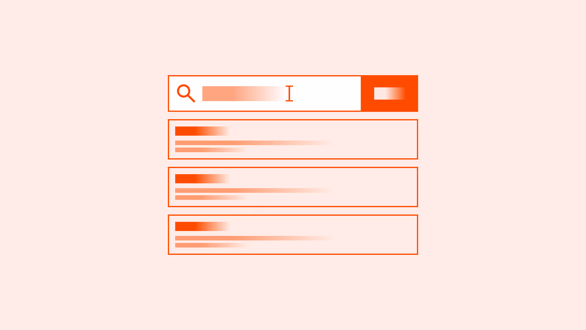
Buttons that contain only an icon are common in modern interfaces, from search magnifying glasses to hamburger menus. They save space and look minimalistic. But icons are not universal language. An icon’s meaning can vary across cultures, contexts, and user experience levels.
Without labels or accessible alternatives, icon-only buttons risk becoming obstacles. With thoughtful design, they can be effective, recognizable, and accessible.
Best practices
Guidelines for designing accessible and usable icon-only buttons.
Use icon-only buttons sparingly
Reserve icon-only buttons for universally recognized actions, such as “Search,” “Close,” or “Play.” For less common actions, use icons with labels.

References:
Always provide accessible labels
Add aria-label (<button aria-label="Close dialog">) or visually hidden text so screen readers can describe the button’s purpose. Without it, assistive technology users are left in the dark.
References:
- Accessible Rich Internet Applications (WAI-ARIA) – W3C
- ARIA: aria-label attribute – MDN Mozilla
- Inclusive components – Heydon Pickering
Pair icons with tooltips when needed
If space is limited, a tooltip on hover or focus can help explain the icon’s meaning. Tooltips should not replace labels in critical workflows.

References:
Maintain strong visual affordance
Icon-only buttons should look interactive: use size, contrast, and clear hover/focus/active states. Do not let them blend into decorative graphics.
References:
Keep consistency in icon style and placement
Icons should come from the same set, with consistent stroke weight, size, and alignment. Consistency builds familiarity and reduces interpretation errors.
References:
Common mistakes
Frequent mistakes when using icon-only buttons.
Using obscure or ambiguous icons
Icons like abstract shapes or custom symbols confuse users, especially without labels.
Not providing text alternatives
Without aria-label or hidden text, icon-only buttons are invisible to screen readers.
Relying only on hover tooltips
Tooltips are not available on touch devices or for some assistive tech. Relying on them alone harms usability.
Inconsistent styling across the interface
Using icons from different sets or with different weights reduces clarity and makes the product feel unpolished.
Summary
Key takeaways for icon-only buttons.
- Use icon-only buttons sparingly and only for universal actions.
- Always provide accessible text labels, either visible or via ARIA.
- Support tooltips where necessary but never rely on them alone.
- Ensure clear affordance, consistent style, and strong states for accessibility.
Done right, icon-only buttons save space without sacrificing usability. Done wrong, they confuse and exclude.
AI prompts
Ready-to-use AI prompts for design agents. Each scenario is pre-loaded with the UX rules from this guide. Copy, adapt to your context, and generate consistent, well-structured output from the start.
Scenario: Toolbar with icon actions
Use when designing a row of icon buttons in a toolbar: text editors, image editors, data table toolbars, where space constraints make icon-only buttons necessary.