Overview
Forms are essential for user interaction, but long and overwhelming forms often lead to drop-offs. Users may feel burdened if asked for too much information at once, especially when not all fields seem relevant.
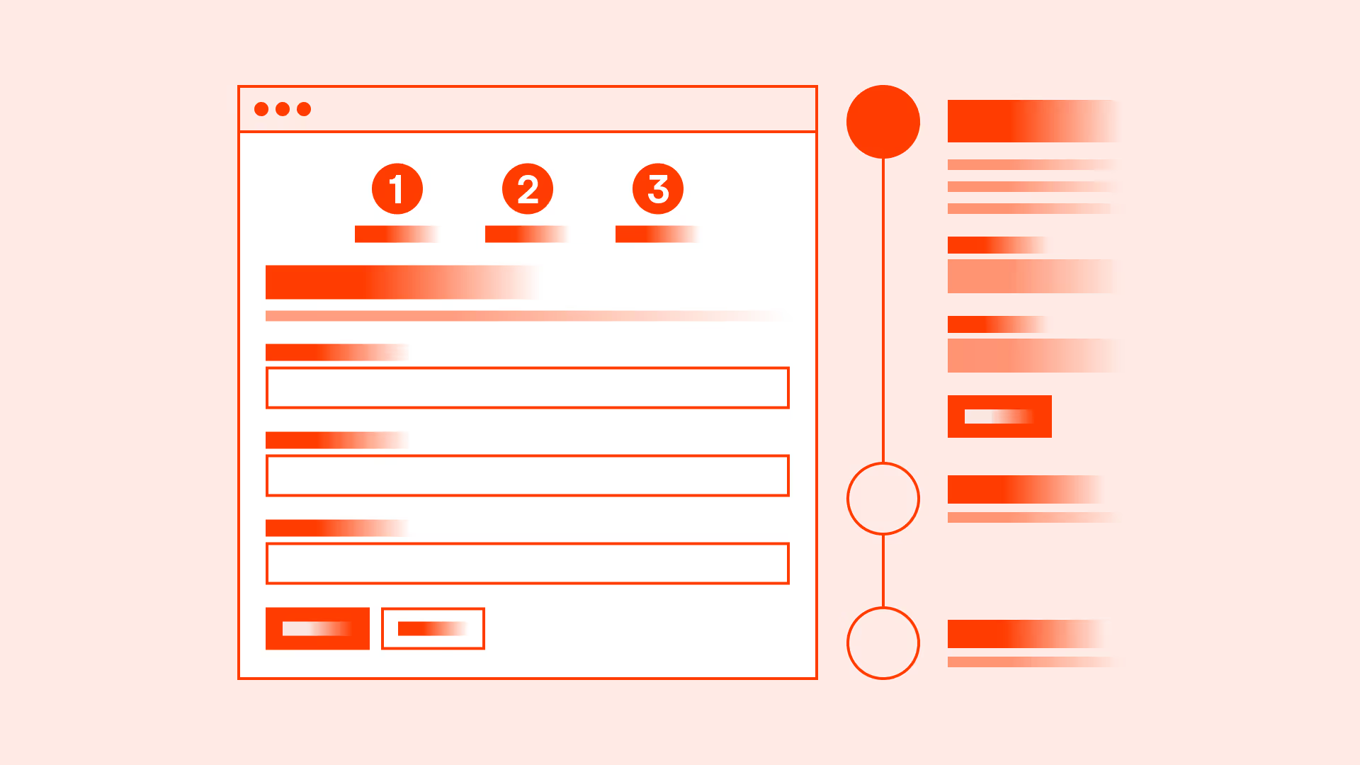
Progressive disclosure is a design technique where only the most important information is shown first, and additional details are revealed gradually. By structuring forms into logical sections or steps, you can guide users through the process, keep them engaged, and reduce the chance of errors.
Best practices
Guidelines for managing form length and using progressive disclosure.
Ask only for essential information upfront
Begin with the fields required to complete the core action. Additional questions should be secondary and asked later if needed.
References:
- Forms that Work – Caroline Jarrett & Gerry Gaffney
- Form design – Baymard Institute
Use progressive disclosure for conditional inputs
Show additional fields only when relevant. For example: if the user selects “Business account,” then display company-related fields.

References:
Break long forms into steps
Multi-step forms reduce cognitive load and create a sense of progress. Use clear step indicators so users know how far they are in the process.

References:
- Designing UX: Forms – Jessica Enders
Provide a clear summary at the end
Before submission, show a review step where users can check their information. This reduces errors and builds confidence.
References:
Make navigation between steps easy
Allow users to go back and adjust previous answers without losing progress. This builds trust and reduces frustration.

References:
Support autosave and persistence
Save progress automatically in multi-step forms so users can return later without starting over.
References:
Common mistakes
Frequent pitfalls when dealing with long forms.
Asking for too much information at once
Overwhelms users and increases abandonment.
Not showing progress indicators
Users do not know how long the form is, creating uncertainty and frustration.
Displaying irrelevant fields to all users
Makes forms look longer and more complicated than necessary.
Forcing users to restart if they go back
Increases drop-offs when users lose data after adjusting earlier steps.
Summary
Key takeaways for form length and progressive disclosure.
- Keep forms focused on essential inputs.
- Break long forms into clear, manageable steps with progress indicators.
- Reveal additional inputs progressively, only when needed.
- Provide summaries and allow easy navigation between steps.
- Save user progress to reduce frustration and drop-offs.
Well-structured forms respect users’ time and attention, making complex interactions feel simple and achievable.
AI prompts
Ready-to-use AI prompts for design agents. Each scenario is pre-loaded with the UX rules from this guide. Copy, adapt to your context, and generate consistent, well-structured output from the start.
Scenario: Multi-step forms or onboarding
Use when a form or onboarding flow requires substantial information that must be broken into manageable steps to reduce abandonment.


