Overview
Disabled UI components are everywhere: inactive buttons, unavailable form fields, grayed-out options. They help set expectations and prevent invalid actions.
But poorly designed disabled states often create problems: low contrast that makes text unreadable, missing explanations for why the option is disabled, or using disable when hiding the element would be better.
A good disabled state communicates unavailability without breaking accessibility or leaving users guessing.
Best practices
Guidelines for designing accessible and clear disabled states.
Ensure disabled elements remain legible
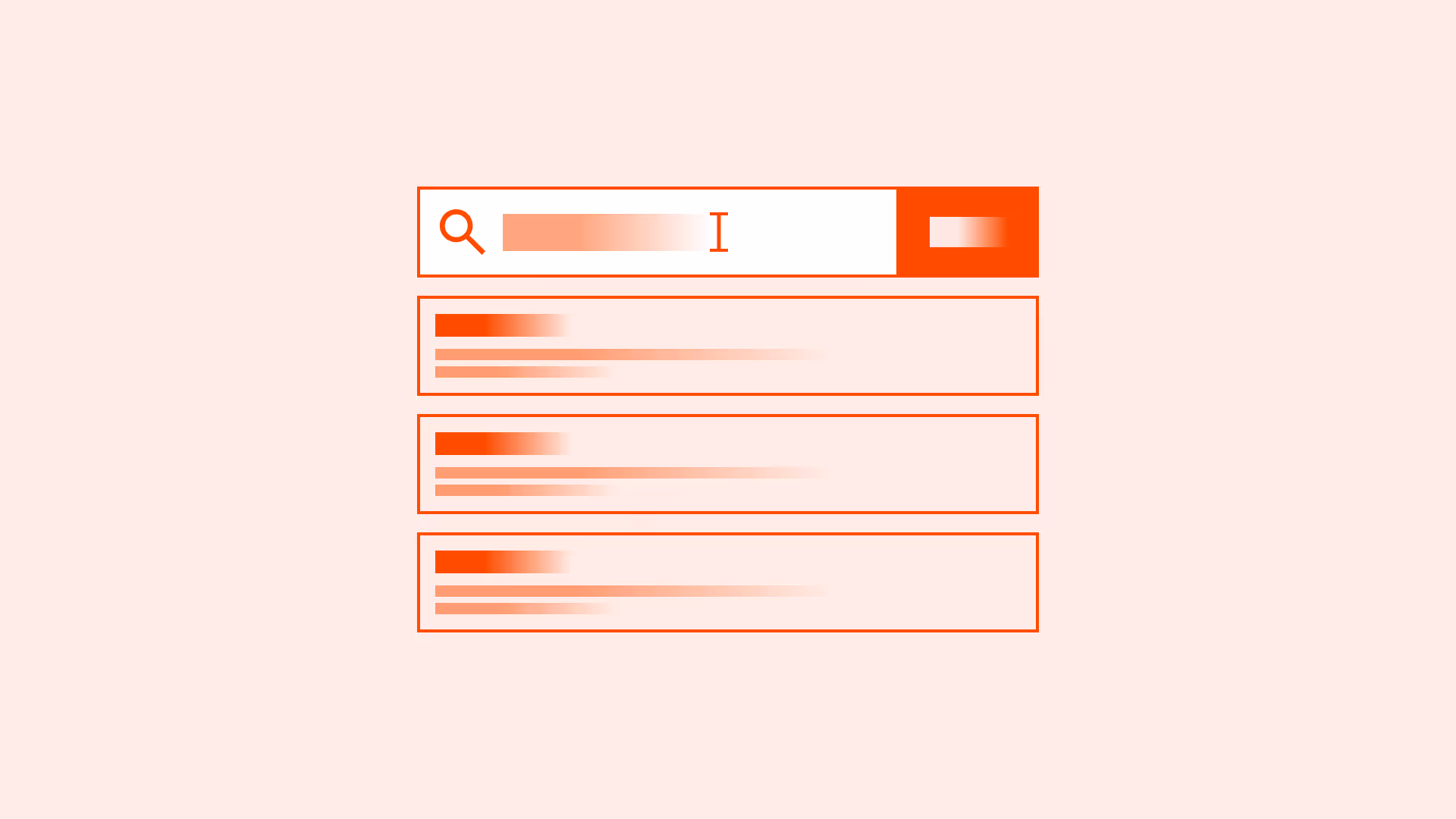
Disabled text and buttons must meet minimum contrast requirements (WCAG 1.4.3). A common mistake is making disabled text too light, rendering it unreadable.

References:
Evidence: WCAG 1.4.3 – Contrast minimum; WebAIM – Contrast and color accessibility
Explain why an element is disabled
If possible, provide context (for example: tooltip or helper text) explaining why the option is unavailable. This reduces frustration.

References:
- Error prevention guidelines – Nielsen Norman Group
- Why disabled buttons hurt UX (and how to fix them) – Nielsen Norman Group
Use disabled states to prevent invalid actions, not as decoration
Only disable actions that truly cannot be performed. Do not disable elements just to guide user flow if they could still act.
References:
Prefer progressive disclosure over disabling in some cases
Instead of disabling unavailable options, hide them until relevant. This makes the interface cleaner. Use discretion: hiding can reduce discoverability.
References:
Maintain accessibility support
Disabled elements should not be focusable but must still be conveyed to assistive technologies (for example: aria-disabled="true"). Ensure screen readers announce disabled state properly.
References:
Common mistakes
Frequent mistakes in disabled states design.
Using low-contrast gray text
Text becomes unreadable and fails WCAG standards.
Disabling without explanation
Users don’t know why they can’t act, leading to confusion.
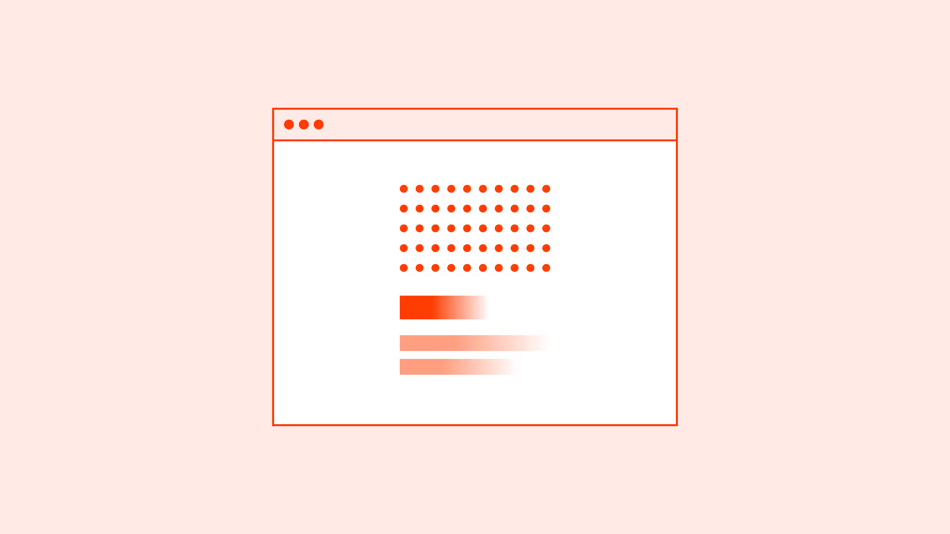
Disabling when hiding would be better
Creates visual clutter and reduces clarity.
Allowing disabled elements to receive focus
Breaks accessibility by misleading keyboard users.
Summary
Key takeaways for disabled states.
- Disabled states must remain legible and meet contrast requirements.
- Provide explanations for disabled actions when possible.
- Disable only when necessary, sometimes progressive disclosure or hiding is better.
- Ensure disabled elements are correctly conveyed to assistive technologies.
Well-designed disabled states reduce errors, improve clarity, and maintain trust. Poor ones frustrate and exclude.
AI prompts
Ready-to-use AI prompts for design agents. Each scenario is pre-loaded with the UX rules from this guide. Copy, adapt to your context, and generate consistent, well-structured output from the start.
Scenario: Disabled form fields
Use when input fields, dropdowns, or controls are temporarily unavailable based on user permissions, subscription tier, or form state.
