
Overview
Color contrast is one of the most fundamental accessibility requirements. If text or controls don’t stand out enough from the background, they become unreadable in bright light, for users with low vision, or for those with color blindness.
WCAG (Web Content Accessibility Guidelines) defines minimum contrast ratios to ensure legibility and equal access. Meeting these standards improves usability for everyone, not just people with disabilities.
Best practices
Guidelines for designing with accessible color contrast.
Meet WCAG minimum contrast ratios
- Normal text (below 18px / 1.125rem regular and 14px / 0.875rem bold): at least 4.5:1
- Large text (18px / 1.125rem + or 14px / 0.875rem bold): at least 3:1
- Non-text UI components and graphical objects: at least 3:1

References:
Test with real tools, not by eye
Use tools like WebAIM Contrast Checker, Stark, or Axe to ensure compliance. Human perception is unreliable.
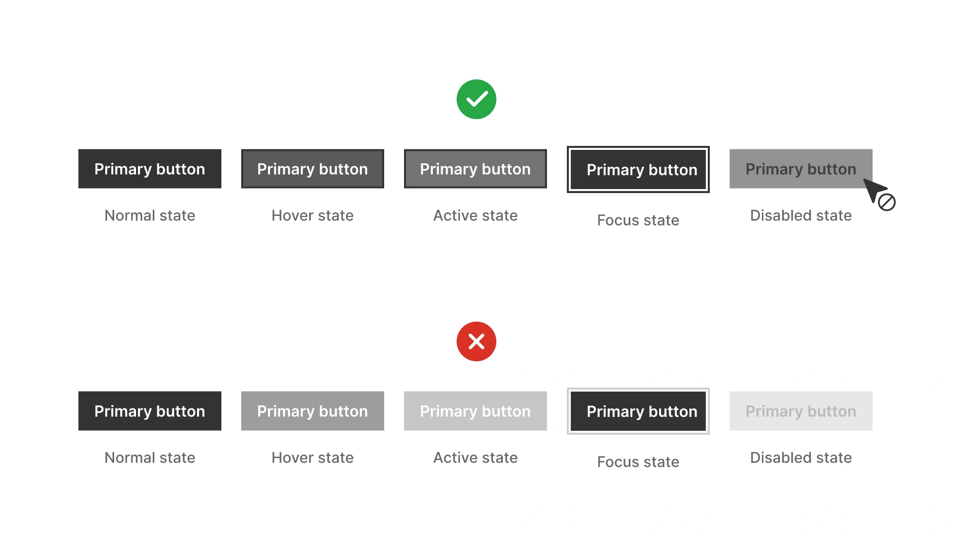
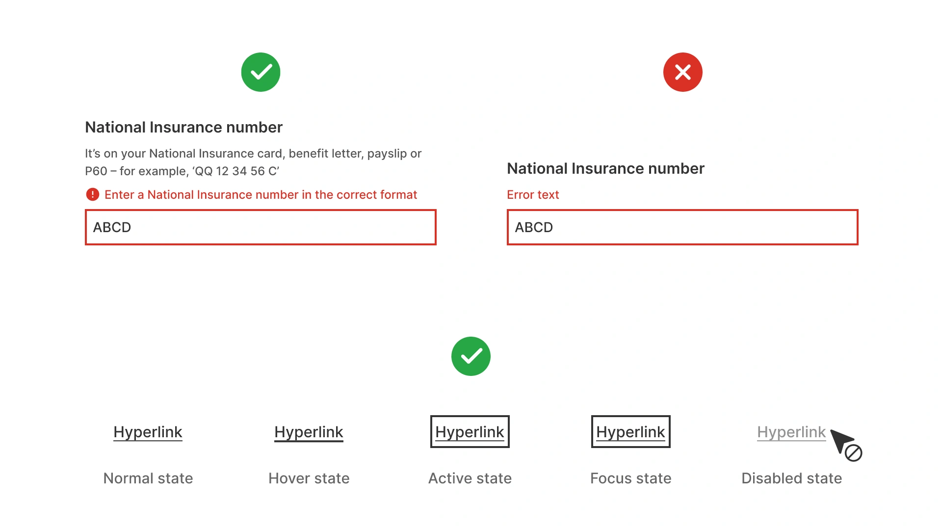
Design for different states
Verify contrast for hover, focus, active, and disabled states. Disabled elements often fail contrast and become unreadable.
References:
Avoid relying only on color for meaning
Contrast must be paired with other indicators (for example: icons, labels, underline for links). This ensures accessibility for users with color blindness.
References:
Consider context and environment
Text that meets WCAG can still be hard to read in sunlight or on poor screens. When in doubt, aim above minimum contrast ratios.
References:
Common mistakes
Frequent mistakes when applying color contrast.
Using light gray text on white backgrounds
Often fails contrast requirements, especially in body text.
Ignoring non-text elements
Icons, focus outlines, and form borders must also meet contrast standards.
Not testing interactive states
Buttons and links may meet contrast only in default state but fail on hover or disabled states.
Relying only on brand colors without adjustment
Many brand palettes need adjustments for accessibility. Blindly following them harms usability.
Summary
Key takeaways for color contrast.
- Always meet WCAG minimum contrast ratios for text and UI elements.
- Test with tools, not by eye.
- Check contrast across all interactive states.
- Don’t rely only on color to convey meaning.
- When possible, exceed minimum ratios for better readability.
Accessible color contrast is not just a requirement, it’s the foundation of inclusive, usable design.
AI prompts
Ready-to-use AI prompts for design agents. Each scenario is pre-loaded with the UX rules from this guide. Copy, adapt to your context, and generate consistent, well-structured output from the start.
Scenario 1: Text on colored backgrounds
Use when designing UI elements where text appears on a colored surface: buttons, badges, banners, status indicators, or any non-white background.
Scenario 2: Dark mode contrast
Use when designing or auditing color contrast for dark mode: colors that pass in light mode often fail when the background changes.