Overview
Checkboxes are among the most common UI components, but misuse can easily confuse users. They are best suited for non-exclusive, multi-selection tasks, like selecting interests, settings, or items in bulk.
Unlike radio buttons (for exclusive choices) or switches (for persistent states), checkboxes allow flexibility. Correct use ensures clarity, consistency, and accessibility.
Best practices
Guidelines for designing and implementing checkboxes.
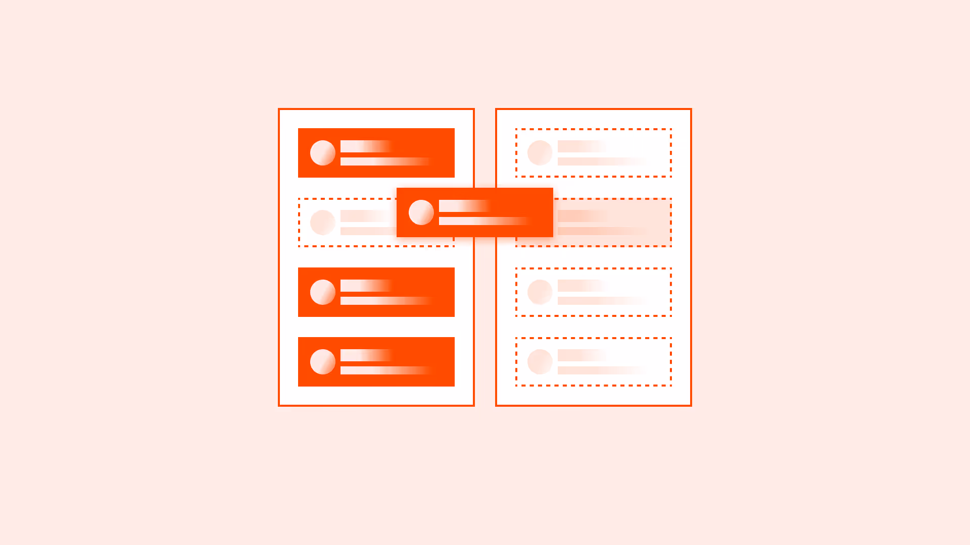
Use checkboxes for non-exclusive selections
Ideal when users can select none, one, or many options. Do not replace them with toggles or switches.

References:
Provide clear, visible labels
Labels must clearly describe the option. Do not rely on placeholder text or tooltips. Associate labels programmatically using <label> or aria-label.
References:
Group related checkboxes logically
Use fieldsets and legends or section headings for related groups, so users can scan quickly.
References:
Support select all and clear options when relevant
For long lists, include a “Select all” and “Clear all” option to reduce interaction costs.
References:
Ensure accessibility states
Use aria-checked or native HTML semantics to ensure assistive technologies correctly announce checked/unchecked. Maintain proper focus order.
References:
Common mistakes
Frequent mistakes when using checkboxes.
Using checkboxes for mutually exclusive choices
Leads to confusion, users expect multiple possible selections.
Not labeling checkboxes clearly
Screen reader users cannot interpret unlabeled checkboxes.
Overloading with too many checkboxes
Long, ungrouped lists overwhelm users.
Inconsistent default states
Mixing pre-checked and unchecked boxes without explanation reduces trust.
Summary
Key takeaways for checkboxes.
- Use checkboxes only for non-exclusive, multi-selection options.
- Always provide visible, programmatically associated labels.
- Group related checkboxes logically for scanability.
- Support accessibility states and consistent defaults.
Done right, checkboxes make choices simple and predictable. Misused, they confuse, overwhelm, and exclude.
AI prompts
Ready-to-use AI prompts for design agents. Each scenario is pre-loaded with the UX rules from this guide. Copy, adapt to your context, and generate consistent, well-structured output from the start.
Scenario: Multi-select list
Use when users can select any number of options independently: notification preferences, filter options, feature selection, or permission settings.