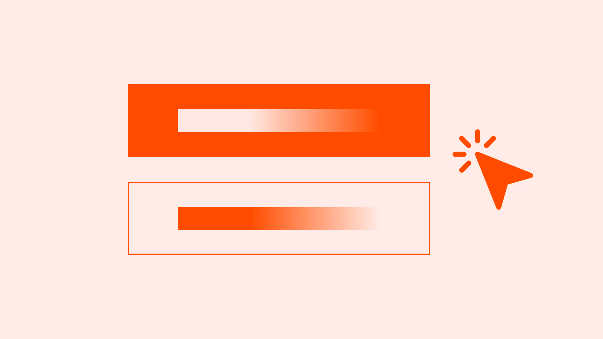
Button hierarchy helps users quickly identify the most important action. Clear distinction between primary, secondary, and tertiary buttons improves clarity, reduces errors, and supports accessibility.
Overview
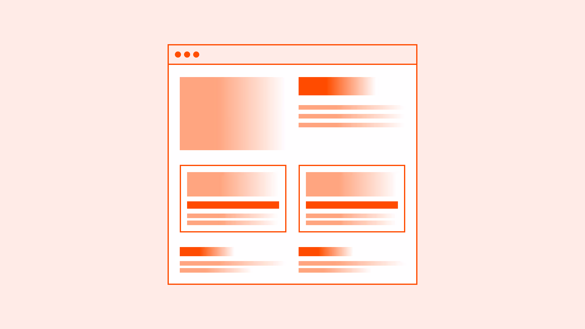
Buttons are among the most frequently used UI components, but without a clear hierarchy they can confuse instead of guide. When every button looks the same, users don’t know where to focus. When too many buttons compete visually, decision-making slows down and errors increase.
A well-structured button hierarchy ensures that users instantly recognize the main action, supportive options, and low-priority actions. This creates consistency, builds trust, and makes interactions faster.
Best practices
Guidelines for designing button hierarchy.
Use one primary button per view
Importance:
Critical
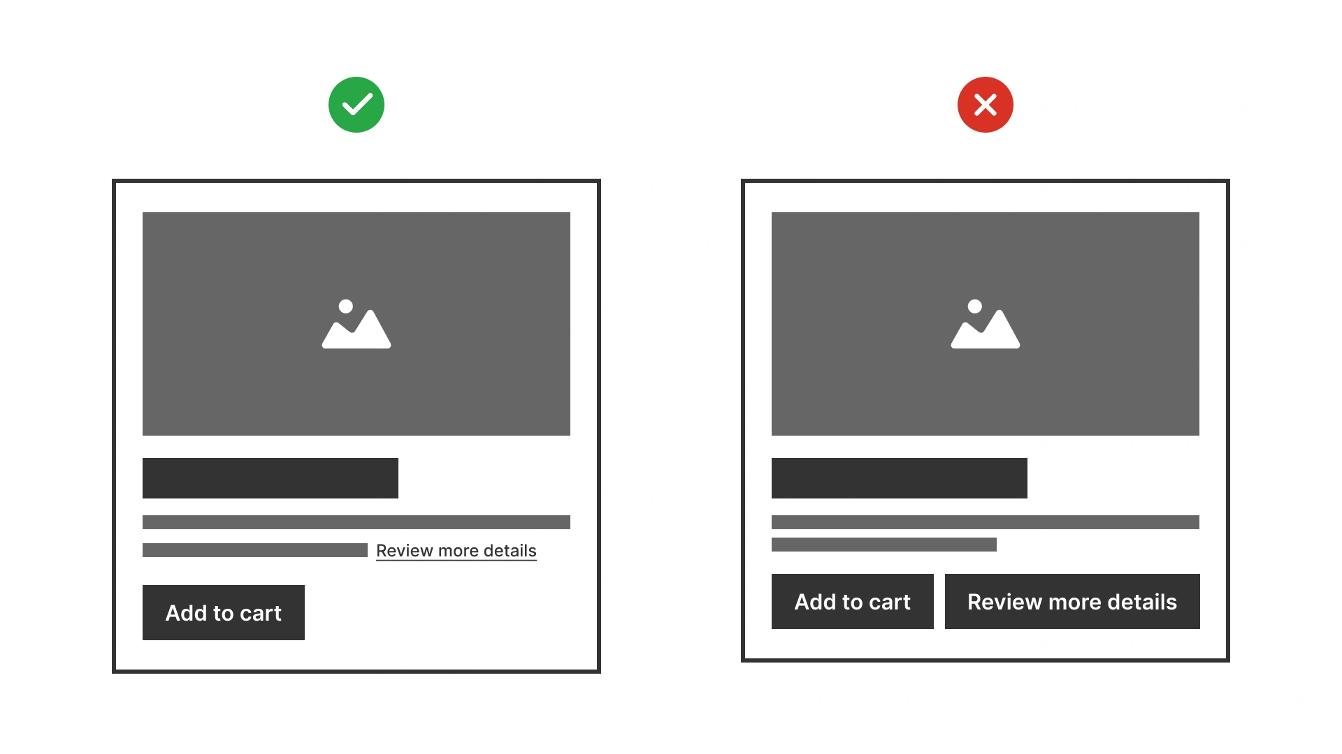
The primary button represents the most important action on a page or screen (for example: “Create order,” “Continue to payment”). There should be only one per view to avoid splitting user attention.
Secondary buttons represent alternative or less critical actions (for example: “Save as draft,” “Back to sign in”). They should be visually distinct but not compete with the primary button.
Tertiary buttons are for low-priority or contextual actions (for example: “Read full description”). They often appear as text-only links styled consistently with the design system.
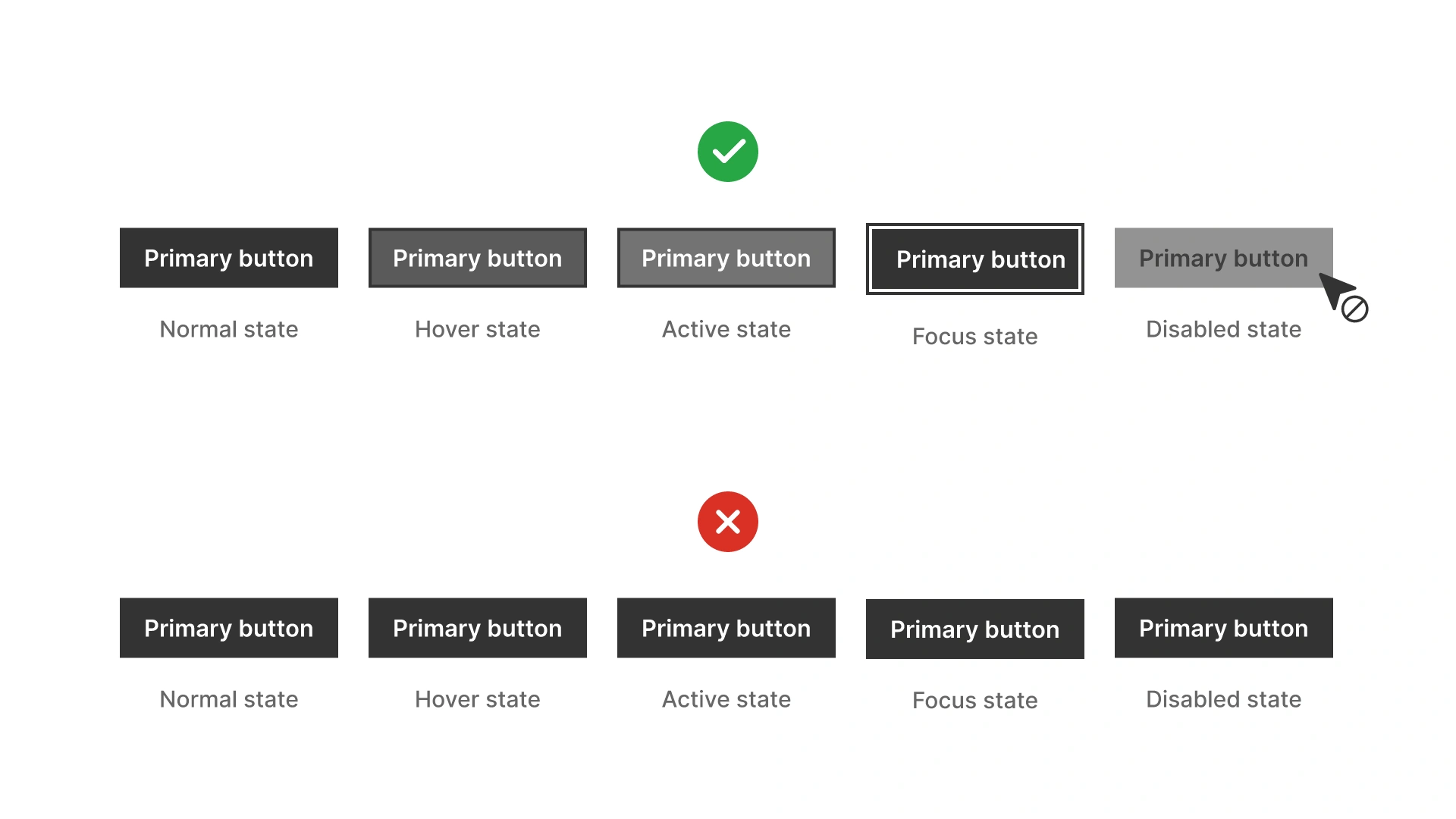
Buttons must have visible focus, hover, active, and disabled states. Use more than color alone to distinguish them (for example: contrast, borders, shadows).
Primary buttons must meet at least 4.5:1 contrast ratio for text. Secondary and tertiary buttons should also meet contrast requirements for both text and outlines.
Overloads the user and creates confusion about the main action.
Making all buttons visually identical
Importance:
Critical
Users cannot distinguish importance, leading to slower decisions.
Styling tertiary buttons like primary
Importance:
Recommended to avoid
Misleads users and breaks hierarchy.
Relying only on color to show button states
Importance:
Critical
Excludes users with color vision deficiencies.
Summary
Key takeaways for button hierarchy.
Use exactly one primary button per view to indicate the main action.
Make secondary and tertiary buttons visually distinct to signal relative importance.
Keep hierarchy consistent across the entire system.
Support accessibility with clear focus and state indicators.
Strong button hierarchy speeds up decisions, reduces errors, and creates predictable, trustworthy interactions.
AI prompts
Ready-to-use AI prompts for design agents. Each scenario is pre-loaded with the UX rules from this guide. Copy, adapt to your context, and generate consistent, well-structured output from the start.
Scenario 1: Form action buttons
Use when designing the submit and cancel actions at the bottom of any form: settings, registration, checkout, or support.
AI prompt
You are a UX-focused design agent. Design the action buttons for a [form type: settings / registration / checkout / support ticket] form.

Rules:
- One primary button per form — the submit action
  Label: specific verb + object ✓ "Save changes" ✓ "Create project" ✗ "Submit" ✗ "OK"
  Style: filled, high contrast, visually dominant
- One secondary button — cancel or back
  Label: "Cancel" or "Discard changes" if edits were made
  Style: outlined or ghost
- Desktop placement: Cancel (left) → Primary action (right)
- Mobile: stack vertically, primary on top
- On submit: disable the button immediately, show loading state inside it: "Saving…"
  Restore if submission fails
- Destructive actions (Delete, Remove): separate from the main button group, danger styling (red), require confirmation before execution

Accessibility:
- Submit: button type="submit"
- Cancel: button type="button"
- Loading state: aria-busy="true" aria-label="Saving, please wait"
- Both buttons: keyboard operable with Enter and Space

Constraints:
- Never use "Submit", "OK", "Yes", or "Confirm" as the only button label
- Never place two visually equal buttons side by side
- Never use a tags for form action buttons
- Never disable the submit button as the only way to communicate validation errors — show the errors
Scenario 2: Page-level actions
Use when a page has multiple possible actions: dashboards, detail pages, list views, and you need to establish a clear visual hierarchy between them.
AI prompt
You are a UX-focused design agent. Design page-level action buttons for a [page type: project detail / user management / document editor / dashboard].

Rules:
- Identify the single most important action on this page — this is the only primary button
  ✓ One primary: "Create project", "Invite user", "Publish"
  ✗ Two primaries side by side: never
- Secondary actions (regular but not primary): outlined or ghost style
  Examples: Export, Filter, Duplicate, Archive
- Tertiary actions (low-frequency): text-only link style or grouped in an overflow menu (…)
- Maximum 3 visible action buttons before grouping the rest in an overflow menu
  The primary action must never be inside an overflow menu
- Destructive actions (Delete, Deactivate): danger styling (red), placed away from constructive actions, separated by whitespace or a divider

Accessibility:
- Overflow menu button: aria-haspopup="true" aria-expanded="true/false" aria-label="More actions"
- All buttons: native button elements
- Destructive actions: label must make the consequence clear — "Delete project" not "Delete"

Constraints:
- Never use more than one primary button in the same page view
- Never put the primary action in an overflow menu
- Never give a destructive action the same visual weight as a constructive one
- Never use icon-only buttons for non-universal actions without a visible text label or tooltip
Scenario 3: Modal dialog actions
Use when designing buttons inside a modal, whether confirming a destructive action, submitting a short form, or closing an informational overlay.
AI prompt
You are a UX-focused design agent. Design the action buttons for a modal dialog that [describes the modal purpose: confirms a destructive action / submits a short form / shows information].

Rules:
- Confirmation dialogs (destructive action):
  Destructive button: specific label ✓ "Delete project" ✗ "OK"
  Cancel button: "Cancel" or "Keep project"
  Placement: Cancel (left) → Destructive action (right)
  Focus on open: move to Cancel button — never to the destructive action
  Style: destructive button uses danger/red styling

- Form modal (submit action):
  Primary: specific submit label ✓ "Save changes" ✓ "Send invite"
  Secondary: "Cancel"
  Placement: Cancel (left) → Primary (right)
  Focus on open: move to first input field

- Informational modal (read-only):
  Single close action: "Close" or "Got it"
  Centered or right-aligned
  No destructive styling needed

All modals:
- Escape key = same as clicking Cancel / Close
- Clicking backdrop = Cancel / Close
- After close: focus returns to the element that opened the modal

Accessibility:
- All buttons: native button elements
- Destructive button: no special ARIA needed, but label must be specific
- Focus management: on open, on close, after submit

Constraints:
- Never label the destructive button "OK", "Yes", or "Confirm" alone
- Never move focus to the destructive button on modal open
- Never close a modal with unsaved form data without warning the user