
Overview
Breadcrumbs are a secondary navigation pattern that shows users where they are in a hierarchy and how to move back. They are especially useful in:
- Content-heavy sites (for example: e-commerce, documentation, directories).
- Multi-level hierarchies where users may enter from search or deep links.
- Situations where orientation and “wayfinding” are critical.
Good breadcrumbs support navigation, improve SEO, and reduce reliance on the back button. Poorly designed breadcrumbs are redundant, inconsistent, or invisible.
Best practices
Guidelines for designing and implementing breadcrumbs.
Use breadcrumbs for deep, hierarchical structures
Breadcrumbs make sense when content sits within a clear hierarchy. They are less useful on flat structures.

References:
- Breadcrumb navigation increasingly useful – Nielsen Norman Group
- Breadcrumbs: 11 design guidelines for desktop and mobile – Nielsen Norman Group
- Designing interfaces – Jenifer Tidwell
Follow a clear and consistent format
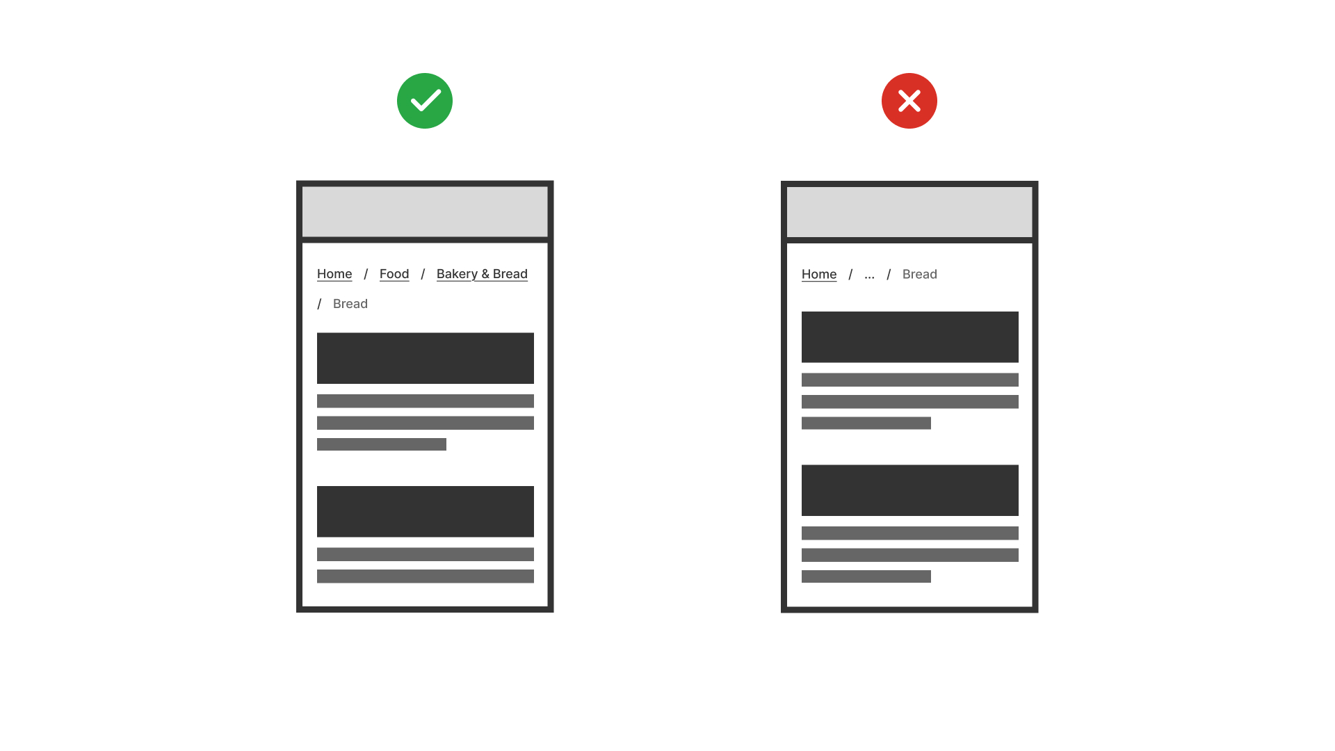
Breadcrumbs should show the full path from the homepage to the current page, separated by a consistent delimiter (for example: › or /).
References:
Make each level clickable
Users should be able to navigate back to any previous step, not just the homepage.
References:
Place breadcrumbs at the top of the page
Positioning breadcrumbs above the main heading ensures users see them before diving into content.
Keep breadcrumb labels short and meaningful
Use concise labels that match page titles. Avoid truncation or vague terms like “Page 1.”
References:
- Content design – Sarah Richards
Support accessibility and responsiveness
Breadcrumbs must be keyboard navigable and screen-reader friendly (aria-label="breadcrumb"). Ensure they adapt well to mobile screens without truncating important context.
References:
Common mistakes
Frequent mistakes when using breadcrumbs.
Using breadcrumbs in flat or shallow structures
Adds unnecessary noise when hierarchy is only one or two levels deep.
Making the current page a link
Confuses users and breaks expectations. The last item should indicate the current location, not a clickable link.
Using inconsistent separators
Switching between symbols (/, ›, >) reduces scanability and looks unpolished.
Overloading with long or unclear labels
Cluttered breadcrumbs are hard to scan and don’t help orientation.
Summary
Key takeaways for breadcrumbs.
- Breadcrumbs are best for deep, hierarchical content.
- Always show the full, consistent path and make each level clickable.
- The current page should be text only, not a link.
- Keep labels short and meaningful, and support accessibility with ARIA and keyboard navigation.
Done well, breadcrumbs help users orient themselves, improve findability, and reduce navigation effort. Done poorly, they add clutter and confusion.
AI prompts
Ready-to-use AI prompts for design agents. Each scenario is pre-loaded with the UX rules from this guide. Copy, adapt to your context, and generate consistent, well-structured output from the start.
Scenario: Deep content hierarchy
Use when content is 3 or more levels deep: e-commerce categories, documentation sections, or nested admin settings, and users may arrive on deep pages without navigating through parent pages.