Overview
Accordions are a common UI pattern for grouping related content while keeping pages concise. They allow users to expand or collapse sections as needed, which works well for FAQs, filters, or secondary details.
But accordions can also harm usability if overused, poorly labeled, or inaccessible. Users may miss hidden content, struggle with navigation, or face accessibility barriers if states are not announced properly.
Best practices
Guidelines for designing and implementing accordions.
Use accordions for secondary or optional content
Accordions are best for content that isn’t essential to complete the main task but provides useful context (for example: FAQ answers, advanced settings, additional details).

References:
Provide clear, descriptive headings
Each accordion header should describe the content inside. Avoid vague labels like “More” or “Info.”
References:
- WCAG 2.4.6: Headings and labels
- Content design – Sarah Richards
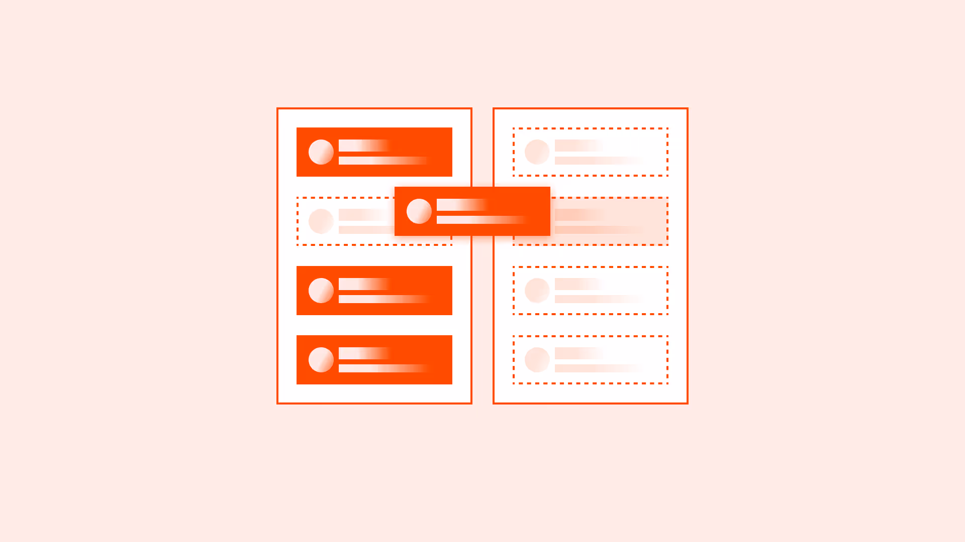
Make section headers fully clickable and align icons properly
The entire header area of an accordion section should be clickable, not just the text or the icon.
Icon placement:
- Position the expand/collapse icon close to the text label to emphasize connection.
- Alternatively, place the icon to the left of the text for stronger association.
- Avoid placing the icon too far away from the label, it may look disconnected.
References:
Ensure accessibility with ARIA attributes
Use aria-expanded, aria-controls, and role="button" on headers. Announce expanded/collapsed states to assistive technologies.
References:
Allow only one or multiple sections depending on context
For FAQs, allow multiple panels open at once. For step-by-step flows, restrict to one open panel to reduce clutter.
References:
Provide “Expand all / Collapse all” option
When multiple accordion sections are present, include a global control to expand or collapse all sections at once. It saves time in content-heavy pages and reduces repetitive actions for keyboard and screen reader users.
Implementation details:
- Place the control above the accordion group.
- Use clear labels: “Expand all / Collapse all”.
- The control should dynamically switch its state (if all are open → show “Collapse all”).
- Must be fully accessible (keyboard + screen readers).
References:
Maintain visible focus states
Accordion headers must be keyboard navigable with clear focus indicators.
References:
Use smooth but fast animations
Animations help users notice changes but should be subtle. Support prefers-reduced-motion.
References:
Common mistakes
Frequent mistakes when using accordions.
Hiding critical information in accordions
Users may miss important details if they remain collapsed by default.
Using vague or repetitive labels
Headers like “Section 1” or multiple “More” buttons force users to open each one to understand content.
Not supporting keyboard navigation
If users can’t expand/collapse with keyboard, accordions become inaccessible.
Overusing accordions for all content
Collapsing too much content forces unnecessary clicking and hurts discoverability.
Summary
Key takeaways for accordions.
- Accordions are best for secondary or optional content, not critical tasks.
- Always use clear, descriptive labels for headers.
- Support accessibility with ARIA attributes, keyboard navigation, and visible focus states.
- Allow one or multiple open sections depending on context.
- Avoid hiding key information or overusing accordions unnecessarily.
Well-designed accordions reduce clutter and improve scanability. Poorly designed, they hide information and block accessibility.
AI prompts
Ready-to-use AI prompts for design agents. Each scenario is pre-loaded with the UX rules from this guide. Copy, adapt to your context, and generate consistent, well-structured output from the start.
Scenario 1: FAQ section
Use when presenting a list of questions with collapsible answers on help pages, landing pages, or support centers where users scan for specific questions.
Scenario 2: Settings panel
Use when organizing settings or configuration options into collapsible sections within a settings page or sidebar.